| Image |
Comment |
| 07/02/2004 12:16:00 AM |
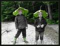
extraordinaryby igfischComment: Maybe whoever lives there has seen Close Encounters of the Third Kind a few too many times...but at least it's outside the house and not in the living room! LOL
Very interesting...definitely not something you see every day. :o) |
| 07/02/2004 12:09:50 AM |
Large Leaves!by aKiwiComment: When I first saw this image, the book "Lord of the Flies" came immediately to mind. Great use of desat. :o) |
 Photographer found comment helpful. Photographer found comment helpful. |
| 07/01/2004 11:57:52 PM |
|
| Photographer found comment helpful. |
| 07/01/2004 11:56:02 PM |
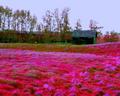
My Own Summerby artvetComment: Reds and magentas seem to be oversaturated....they "glow" off of the trees in the background. Interesting composition and detail. :o) |
| Photographer found comment helpful. |
| 07/01/2004 11:52:59 PM |
Picture Windowby peeceeComment: Horizon appears to be tilted down to the left. Colors and textures are beautiful! :o) |
| Photographer found comment helpful. |
| 07/01/2004 11:30:20 PM |
Send in the Clownsby Prime_TimeComment: This would be a really nice portrait or even a poster if it were cropped a bit more on the right and the lighting were a touch brighter, so we could see more detail of the sad expression. :o) |
| Photographer found comment helpful. |
| 07/01/2004 11:29:38 PM |
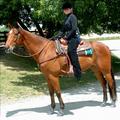
Samantha's Challengeby NeuferlandComment: This really isn't what comes to mind when considering a "studio portrait" IMHO. It is a good picture of the young lady and the horse, however some of the highlights are a bit blown out. The shadow cast on her face from the hat is a bit distracting as well. :o) |
| Photographer found comment helpful. |
| 07/01/2004 11:28:09 PM |
Relaxing pose between two shotsby menardmamComment: If she were looking up at the camera or off into the distance, this would work so much better. Her pose, hair color, and the soft lighting are all in place to make a good portrait, but her downward glance just does it in. :o) |
| Photographer found comment helpful. |
| 07/01/2004 11:27:02 PM |
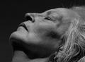
The Moon Studioby WildpurpleComment: This image is just a bit to artsy for my taste, especially when considering a color studio portrait...it isn't really what comes to mind. Interesting lighting and effect, however. :o) |
| Photographer found comment helpful. |
| 07/01/2004 11:26:13 PM |
All Aboardby pumaComment: Although this is a nice snapshot of your model, it really doesn't say "studio portrait" to me. The area behind her head and the highlights along her arm are extremely hot, and the reflections in her sunglasses are distracting. I do like the off-center composition and her natural pose. :o) |
Home -
Challenges -
Community -
League -
Photos -
Cameras -
Lenses -
Learn -
Help -
Terms of Use -
Privacy -
Top ^
DPChallenge, and website content and design, Copyright © 2001-2026 Challenging Technologies, LLC.
All digital photo copyrights belong to the photographers and may not be used without permission.
Current Server Time: 06/19/2026 11:20:20 PM EDT.