| Image |
Comment |
| 07/03/2005 04:56:26 PM |
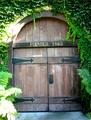
sattui entry.jpgby RikkiComment: This one needs a rotation clockwise. The greens are very lush, it's a shame the light is so harsh on the left side of the frame, blowing out the leaves/flowers and the bright spot on the doorway. I bet this would be a great duotone as well. :) |
 Photographer found comment helpful. Photographer found comment helpful. |
| 07/03/2005 04:55:19 PM |
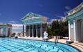
hearst castle.jpgby RikkiComment: My favorite of the series you selected for me to comment upon...this is very striking with lots of colors, details, and textures. I'm sure this would be beautiful up on a wall! :) |
| Photographer found comment helpful. |
| 07/03/2005 04:54:26 PM |
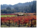
Colors of Fallby RikkiComment: Ah this is very nice...great scenery and location. It's so unfortunate about that blown-out sky. Replace that white patch with some blue or a sky from another photo and you have a really pretty print here. |
| Photographer found comment helpful. |
| 07/03/2005 04:53:37 PM |
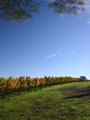
de lorimier.jpgby RikkiComment: Beautiful colors and scenery. I think this would be pretty framed. I don't particularly like the trees at the top; they make me think they're hanging upside down. I'd prefer the sky alone but that's just me. Overall it's a gorgeous picture. :) |
| Photographer found comment helpful. |
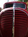
| 07/03/2005 04:52:11 PM |
smile.jpgby RikkiComment: On this one, I would be inclined to replace the background entirely with black, and really bump up the red. You can replace the reflections in the chrome as well, but they're not distracting. It might need a minor rotation to the left, less than a degree...I wish I could photograph cars like this. :o) |
| Photographer found comment helpful. |
| 07/03/2005 04:49:19 PM |
Big Brown Eyesby RikkiComment: OMG that looks like a creepy cross between a gremlin and a tree frog! How unusual! It would be great if you could clone out the person in the background. Nice color and focus! :o) |
| Photographer found comment helpful. |
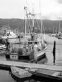
| 07/03/2005 04:48:22 PM |
kay-D.jpgby RikkiComment: This is an interesting shot with lots to look at. It would have been nice to have the tops of her masts visible instead of being cut off, but sometimes that can't be helped. I think the focus is good; perhaps a bit more USM could make the name more sharp. The b/w is nice. Did you convert it to disguise a rather dull sky or was the shot a bit overexposed? The contrast could probably be increased a little and the sky burned for a bit more drama. Nice image, though. :o) |
| Photographer found comment helpful. |
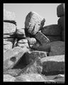
| 07/03/2005 03:44:31 PM |
The Thinkerby KaveyComment: This is fascinating... I'd love to see this place in person some day! Really nice textures and shapes in this image...the one distraction is the shadow coming across the bottom right diagonal, but it doesn't detract from the image. I think the title is perfect. Well done! :) |
| Photographer found comment helpful. |
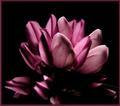
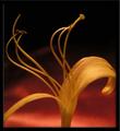
| 07/03/2005 09:58:49 AM |
Sun Kissedby smilebig4me1xComment: Now this lighting experiment is really nice. The backlighting gives a unique perspective, a mood, and shows the textures of the petals as well as the colors. Keep the experimenting up...you're doing an outstanding job!! :) |
| Photographer found comment helpful. |
| 07/03/2005 09:57:26 AM |
Summers texturesby smilebig4me1xComment: This one is exquisite. I think the colors blend perfectly together and really enhance this image. Well done! :o) |
| Photographer found comment helpful. |
Home -
Challenges -
Community -
League -
Photos -
Cameras -
Lenses -
Learn -
Help -
Terms of Use -
Privacy -
Top ^
DPChallenge, and website content and design, Copyright © 2001-2026 Challenging Technologies, LLC.
All digital photo copyrights belong to the photographers and may not be used without permission.
Current Server Time: 06/22/2026 01:23:04 AM EDT.