|
|
|
Showing 1521 - 1530 of ~3951 |
| Image |
Comment |
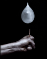
| 06/07/2006 07:34:50 PM | A Moment Beforeby DjabordjaborComment: Greetings from the Critique Club! :)
This is a great setup...your choice of subject, your lighting, your processing...they all worked together and scored very well for this challenge. The display of tension and impending doom is quite well done and I tip my hat. I think that the only suggestion I can make for an improvement would be to crop more on the right side and make it a tiny bit more off-center, but that's just a nitpick on my part.
Keep shooting, and let me know if you have any questions about this critique. :)
Take care,
Laurie |  Photographer found comment helpful. Photographer found comment helpful. |
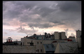
| 06/07/2006 07:32:04 PM | Here Comes the Sunby RebeccaComment: Greetings from the Critique Club! :)
This is a great natural scene that you captured well. I agree with your first commenter about the balance isssue...the shot does appear to be more heavy on the right and light on the left, if that makes sense. I think that in a weather or landscape challenge, your score might have been higher. For this particular challenge, however, I think voters were a bit more finicky about presentation and definite link to the challenge (i.e. being able to tell the song without reading the title). When I look at it, I think more "There Goes the Sun" than "Here Comes the Sun" since the storm is the subject, not the sun itself. Plus, as pretty as the scene is, there is really not much of the elusive "wow" factor. The bottom half of the image is rather dark...maybe a boost in contrast and saturation a bit more could make it pop a little more. Still, scoring a 5.6 is good and I think you'll only continue to do better the more challenges you enter.
Keep clicking and let me know if you have any questions! :)
Take care,
Laurie | | Photographer found comment helpful. |
| 06/07/2006 07:25:54 PM | Backlit Kiwiby nlghttrainComment: Greetings from the Critique Club! :)
This is a visually interesting image, full of color and detail. I think that the only thing that strikes me in a negative way upon first glance is the size...for a challenge anyway. I'm thinking that your score would have been even better if we were able to display it at a larger size. As it stands, it scored very well and you received a lot of comments that were similar in regard to the interest, detail, and color. The lighting is very nice and plays on the natural color of the fruit well.
Keep clicking and let me know if you have any questions about this critique! :)
Take care,
Laurie :) |
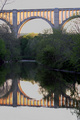
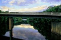
| 06/06/2006 05:09:54 PM | 9th wonder of the worldby riderComment: Greetings from the Critique Club! :)
This is quite a beautiful scene. I love the reflection in the water. My first gut reaction to the image is that I wish it were wider...my eyes keep searching for the span of the bridge, as the narrow presentation makes it feel sort of cramped. HOWEVER, this presentation also accentuates the height, so I guess it's a catch 22. I love the golden hue of the light, and it appears that you shot it at a great time of day. I would like more light on the trees; perhaps some curves and dodging would bring out the details a bit more. I think some saturation boost might be in order as well. Of course, I'm viewing this from an LCD panel at work so it could all be my monitor.
As far as the challenge goes, I think people were looking to be more "wowed" than to simply appreciate good images of pretty places. It's a great shot, and in a bridge challenge it would probably have placed much higher.
Keep shooting and if you have any questions, please let me know. :)
Take care,
Laurie
Critique Club :) | | Photographer found comment helpful. |
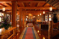
| 06/06/2006 05:05:57 PM | The Lodge, 1917by dannyleeComment: Greetings from the Critique Club! :)
This is a very lovely image...warm and inviting. I love the lighting and the whole range of colors present. Technically it is very well-done, focus is sharp, contrast is good. Your picture is very well composed...the rugs seem to lead you right through the middle and into the back. At first glance, I thought I'd rather see it follow more of the rule of thirds, but as I study it more and more I think the central composition is the best choice for this particular shot.
The fact that it does lead you right through to a doorway and wall is both good and bad. I can understand that it doesn't really lead to a specific point of interest, but then again, there are some shots that just really don't have or need a major focal point, as the entire image is a focal point on the whole. I can see this working well for stock or for a magazine spread.
Again, I think it's lovely and the score seems appropriate for this challenge. I'm sure voters were looking for more "wow" than this kind of serenity and substance.
Keep shooting and if you have any questions let me know. :)
Take care,
Laurie
Critique Club :)
| | Photographer found comment helpful. |
| 06/06/2006 02:23:48 PM | Southern Sunby tonyvComment: Hi Tony...Greetings from the Critique Club! :)
This is a lovely building and the image itself has a very warm appeal. I think it is a bit too "flat" to really make an impact with voters, however. The colors are nice but not vibrant. I think Rikki hit the nail on the head in his comment about there not being a real interest point as well. I think that a closer shot of the spire, at a different time of day with more light and more saturated color, might really do the building a bit more justice. Voters here don't want just a good picture of a pretty building, they want to be "WOW"ed. ;)
The building also seems to be leaning ever so slightly, so correcting the lens distortion in PS or whichever editing program you use might be helpful.
Keep shooting. You have great images in your portfolio that I could never replicate...just keep clicking! :)
Take care,
Laurie
Critique Club :) | | Photographer found comment helpful. |
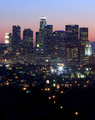
| 06/06/2006 02:18:53 PM | city planningby thehitterComment: Greetings from the Critique Club!
This is lovely...good composition overall, good color. The trail of lights leading the eye up into the frame and into the tall buildings is nice. Your long exposure with a small aperture has given you great points of light. Overall, I get the impression that the image could use some contrast and saturation in the center part...perhaps selecting the sky and then inverting the selection to everything else in the image, then boosting the contrast and saturation a bit might give it more "oomph." I hope that makes sense. :)
Challenge-wise, I think voters were looking for more specific details in architecture rather than in a general form, such as with a whole skyline instead of just part of a building. That's neither here nor there, because voters are always unpredictible. ;)
You've scouted a great location for skyline shots...I'd go a bit wider and really play on the color and contrast for the most drama possible.
Take care,
Laurie
Critique Club :) |
| 06/06/2006 02:14:27 PM | Roofs !by GlouComment: Greetings from the Critique Club! :)
What a fascinating find...such interesting structures and textures. I think, just from first glance, I'd offer these suggestions to make this image come alive.
Your composition from left to right is OK, but from top to bottom is rather static. Your "roofs" cut the image in half, with them at the bottom and the sky on the top. I realize you want to include as much of that dramatic sky as possible, but the challenge is Architecture and the sky is really secondary in the image as far as the voters are concerned. Tilting the camera down and losing some of the sky (see the rule of thirds) would make it more visually dynamic.
The buildings themselves are rather flatly lit and have little light on them. Shooting at a time of day when the light is a golden hue or a pale pinkish hue would add a lot of magic to the scene. You might not have as great a sky for a background, but then again, for this challenge anyway, the sky is less important than the subject, which is the interesting roof/buildings. Adjusting levels, curves, and some intricate dodging and burning would go a long way to add drama.
I think you have a good eye for finding neat things to shoot...keep up the good work and if you have any questions, let me know! :)
Take care,
Laurie
Critique Club
| | Photographer found comment helpful. |
| 06/06/2006 02:04:30 PM | James River Postcardby SJCarterComment: Greetings from the Critique Club! :)
I'm so tickled that I got your image to critique...it's always nice to do one for someone I know and someone that can really appreciate the effort involved.
This is a really beautiful scene...gorgeous view, great vantage point, and lovely colors. I personally like the painterly quality of it all, but some do not like that...particularly in challenges. Compositionally, I think that a more head-on viewpoint rather than this one at more of an angle would help voters feel more balanced as they view the image, but of course, that may have been completely out of your control. It does appear to be angled up ever so slightly on the left end as well. I almost think a lower viewpoint would help as well, so that we can see the tops of the trees (or at least more of whatever's back there) in the back of the scene under the bridge.
The sky is rather noisy, which is common in the blue channel. I'm viewing this on a LCD screen, so it's going to show up as more noisy with that, so take that with a grain of salt. The reflection shows a lot of noise as well, so maybe some selective noise reduction in the blue channel, just on the sky and the water, might help a bit.
Challenge-wise, this is probably stretching for an architecture challenge...the bridge, of course, is a beautiful example of architecture and design, but voters really don't like to have to think much about the topic and need to have that whole "in your face" thing when viewing an image for all of three seconds during voting. Still, I am kind of surprised that this only received a 5.03 during voting...but I am a sucker for scenes such as this one.
Your work is always intriguing and inspiring...keep it up! :)
Take care,
Laurie
Critique Club :)
| | Photographer found comment helpful. |
| 06/04/2006 11:01:52 AM | |
|
Showing 1521 - 1530 of ~3951 |
Home -
Challenges -
Community -
League -
Photos -
Cameras -
Lenses -
Learn -
Help -
Terms of Use -
Privacy -
Top ^
DPChallenge, and website content and design, Copyright © 2001-2026 Challenging Technologies, LLC.
All digital photo copyrights belong to the photographers and may not be used without permission.
Current Server Time: 06/20/2026 05:44:06 PM EDT.
|