|
|
|
Showing 4221 - 4230 of ~6721 |
| Image |
Comment |
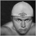
| 11/18/2006 07:51:47 PM | Just Meby jeroweComment: Greetings from the Critique Club: I have been assigned your photo to critique and here are my thoughts:
Personal Reaction: I liked this a lot and it was helpful to see your comments on the photo. With the backwards cap and your bare chest and shoulders, it looks a bit like a swim team photo.
Composition: Good composition; eyes just below center line; face offset; negative space around your head. All these elements seem to work well.
Technicals: Hard to find fault with much. There is a slight halo beside your ear but it’s a minor minor thing. Focus on the eyes is very good.
Conclusions: You were trying for a “whimsical intensity” and you nailed it. Good job!
As always, this is my personal opinion. Feel free to PM me if you’d like further dialog.
|  Photographer found comment helpful. Photographer found comment helpful. |
| 11/14/2006 07:50:03 PM | Halloween Sunriseby ljc576Comment: Greetings from the Critique Club: I have been assigned your photo to critique and here are my thoughts:
Personal Reaction: My initial reaction to your photo was positive. I liked the composition and colors. From your comments, this had to be a pleasant morning and I can feel that in your photo. Scoring above 5 on your first challenge is very good, a fine accomplishment in and of itself. Congratulations!
Composition: Composition is good. I like how the clouds lead my eye into the photo. I like the negative space around the trees.
Technicals: Color is good but feels a little dull. I attribute this to the post processing. (See below.) Contrast good. DoF good. Focus good. Lighting is good, but possible a little dark.
Conclusions: Where this image falls down is in post processing. You mentioned in your comments you had trouble getting the image sized correctly. It is about 24K where the limit is 150K. This results in the pixilation you can see. While it is Photoshop specific, this tutorial will help you better understand how to resize your photos for DPC: //www.dpchallenge.com/tutorial.php?TUTORIAL_ID=26. Also remember to convert your color space to sRGB before saving for DPC. This will maximize color fidelity.
As always, this is my personal opinion. Feel free to PM me if you’d like further dialog.
|
| 11/14/2006 07:22:33 PM | Why ?by sandeep_tataComment: Greetings from the Critique Club: I have been assigned your photo to critique and here are my thoughts:
Personal Reaction: My initial reaction to your photo was very positive. Good looking model. Thoughtful pose. Very good photo.
Composition: Composition is excellent. It really brings attention to the eye, and then to the rest of the face. The shoulder in the background diminishes this a bit. I am sure it is an optical illusion, but the shoulder looks folded forward unnaturally, almost like it is someone else’s shoulder. A bit distracting.
Technicals: Lighting is excellent. Good DoF although blurring the shoulder a bit more might have helped, either with shallower DoF or with Gaussian blur. Color is interesting. There is a bit of a color cast. I am wondering if it would be better with a conversion to B&W. And if possibly subsequent conversion to Sepia would have strengthened it. A third possibility would be to use a Hue/Saturation layer and take out a little bit of yellow. I don’t have the original to play with but you might try that.
Conclusions: Excellent image. It’s publication or advertising worthy and deserved a higher score than it received in my opinion. Color cast and shoulder treatment probably cost you 1-2 points in voting. You are pretty new to DPC. I hope you will remain an active participant. I like you style and would like to see more of it.
As always, this is my personal opinion. Feel free to PM me if you’d like further dialog.
| | Photographer found comment helpful. |
| 11/14/2006 12:22:48 AM | Over cloudsby nikmaticComment: Greetings from the Critique Club: I have been assigned your photo to critique and here are my thoughts:
Personal Reaction: My initial reaction when I saw this was, “Oh, not another airplane window shot!” But almost instantly I regretted that initial prejudice. While I didn’t vote on this challenge, I would have given it a 6 or maybe a 7.
Composition: The composition is strong. You have nice leading lines along the wing edges. The lines of the engines force the eye into the photo. The reflection is superb. The background has a hidden treasure of ground under the clouds. Very well done!
Technicals: Color, focus, DoF, sharpness, and contrast are excellent. I don’t think I’d change anything.
Conclusions: So why the 5.7 score? Part of my reaction comes from the fact that I am an aviation enthusiast. I liked the photo, in part, because of my affinity for your subject and the out-of-the-box point of view. Most folks who fly don’t look out the windows, and aren’t fascinated with cloudscapes. In prior challenges, there have been lots of airplane-window-cloudscapes. It may be that for most voters the subject just didn’t hold that much interest. There may also have been a slight DNMC element to the voting: cloudscapes aren’t “real landscapes” after all. I’m not sure.
In the end, I feel this is a very worthy photo. You took some risks, which I like, and you got a very nice result. I hope you’re proud of this fine image!
As always, this is my personal opinion. Feel free to PM me if you’d like further dialog.
| | Photographer found comment helpful. |
| 11/12/2006 07:58:54 PM | 35 MPH !by DrakeComment: Greetings from the Critique Club: I have been assigned your photo to critique and here are my thoughts:
Personal Reaction: My initial reaction to your photo was that your photo, “nailed the challenge theme.” Having said that, the photo doesn’t grab me or hold my interest.
Composition: Composition is good. I like the way the flag breaks in from the corner. Focus on the flag is fine. The strong motion blur emphasizes the wind. Good job.
Technicals: The background is weak. The lower right is over exposed and out of focus. The upper left is focused fine but under exposed. As a result, there is nowhere in the photo for my eye to come to rest. If you improved the focus and exposure, it might add a point to my score. Or possibly if you had included the flag pole in razor sharp focus, that too might have helped. Anything for my eye to rest on.
Conclusions: I didn’t vote on this challenge, but had I voted, I would have given this a 4. A combination of weak subject and lack of a resting point for my eye hurts the photo. One additional thing to remember is that this is an international site. The US isn’t held in very high regard internationally at the moment, and shooting the US flag may have cost you some points. It’s not a photographic point, but an element of context you need to consider about your audience.
I have looked at your portfolio, which is outstanding, and this doesn’t quite live up to the rest of your work. Keep shooting and I hope to see many more great shots from you in the future.
As always, this is my personal opinion. Feel free to PM me if you’d like further dialog.
| | Photographer found comment helpful. |
| 11/12/2006 07:45:12 PM | Showing the Flowby tpastoreComment: Greetings from the Critique Club: I have been assigned your photo to critique and here are my thoughts:
Personal Reaction: Before I looked to see which challenge you had entered, my first reaction to the shot was favorable. Then as I understood the challenge and reflected on how well it met the challenge, my reaction to the photo was diminished a bit.
Composition: The composition is fine. You have offset the car in the frame slightly which strengthens the composition. I might have moved the car slightly to the left giving it “room to run” in the frame. You got some comments about lowering the point of view and I think that might have helped some. At least with a set-up shot, you have the freedom to try different angles.
Technicals: Focus is good, DoF is good. Colors are good but a dark gray (vs. black) background might have added drama. The dark car disappears into the background and the overall exposure is so dark that I can’t see many car details. I think if your setup hadn’t failed, you might have got more smoke and that might have also overcome some of the exposure problems. But without the perfect smoke, you might have been able to improve it by boosting brightness a little.
Conclusions: Thanks for including the context of your shot in the Comments. I am stunned at the lengths you went to in the set up. And I’m sorry it failed before you got that final shot. I think voters in general may have missed the connection to the Wind challenge theme. With a fully operating setup, it might have been obvious. I would be interested in seeing your reshoot with fully charged batteries, compared to this one.
As always, this is my personal opinion. Feel free to PM me if you’d like further dialog.
|
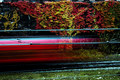
| 11/03/2006 07:31:12 PM | Leaving Platform Nine and Three Quartersby GuGiComment: Greetings from the Critique Club: I have been assigned your photo to critique and here are my thoughts:
Personal Reaction: I liked the photo right away. But it didn’t hold my attention for very long. Although I didn’t vote this challenge, I probably would have given it a 5, possibly a 6. But I am a critical voter.
Composition: Good composition. I like that I can see the top of the hedge. I like the placement of the red streak. I like that the red streak is more heavily weighted to the left adding a real sense of motion. And I like that I can see the graffiti through the blur. So, great job on the composition.
Technicals: Good focus & DoF. Very good color. Possibly a bit over sharpened. Your timing was flawless!
Conclusions: So why the middle-of-the-pack score? I think what grabbed my attention first was the bright vibrant color. But the subject didn’t live up to the expectation the color set. It wasn’t that strong or that intrinsically interesting of a subject. The other issue some voters may have had was that it was a clichéd image. As a blurred motion shot, you did a splendid job. But many voters have done it themselves and once they got it right, they lost interest in the technique.
As always, this is my personal opinion. Feel free to PM me if you’d like further dialog.
| | Photographer found comment helpful. |
| 11/02/2006 03:10:35 AM | The Morning Runby vxpraComment: Greetings from the Critique Club: I have been assigned your photo to critique and here are my thoughts:
Personal Reaction: This is a very good image, for which you got a good (but not great) score. I liked it. And while I didn’t vote this challenge, I would have given it a seven.
Composition: Most would counsel you to avoid a centered composition. In this case it worked very well! So ignore that advice if your receive it.
Technicals: The technicals are all fine: focus; DoF; color; levels and so on. But the image feels flat to me. This sometimes happens when you use Shadow/Highlight. I would try to use curves first, then Shadow/Highlight as a last resort. And for sure, use a better B&W conversion than “Desat.” You said you had tried channel mixer, which gives me my best results. Next time, I suggest you try harder.
Conclusions: Great image. Very nice mood. The only thing standing between your 6.09 and a 7 was the lack of depth and texture in the image.
As always, this is my personal opinion. Feel free to PM me if you’d like further dialog.
| | Photographer found comment helpful. |
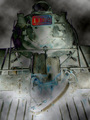
| 11/02/2006 02:37:44 AM | Night trainby snafflesComment: Greetings from the Critique Club: I have been assigned your photo to critique and here are my thoughts:
Personal Reaction: My initial reaction was that I loved this image. My second reaction, seeing your description was, “It’s probably illegal.” I am not sure “cloud difference” is legal … but you got away with it. Check w/ Site Council for clarification. It is obvious you are a risk taker and I feel there is too little risk taking here. So kudos for your risk seeking image!
Composition: Simply wonderful. I like the low angle of the photo a lot. I really like the “swoosh” at the bottom trending up and to the right. It manages my eye and brings it back around. It ties in well with the circle of the boiler which brings my eye back around yet again.
Technicals: This is not a very “approachable” image. If I am inclined to resonate with it, I will. If not, well, you’re toast! I can find no technical fault with it. But its post processing is way out-of-the-box. I, personally, like it but it will appeal to a limited audience. If you aspire to higher scores, go more main stream. I hope you won’t because I’d like to see more of this style!
Conclusions: You got a poor score, because it was far from the expectations of most voters. They are narrow-minded. My only council is to please yourself, keep taking risks, and expect that these risks will not always be rewarded with high scores. Van Gogh was never appreciated during his life time. Maybe you’ll be luckier!
As always, this is my personal opinion. Feel free to PM me if you’d like further dialog.
| | Photographer found comment helpful. |
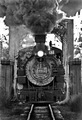
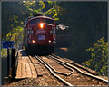
| 11/01/2006 06:56:06 PM | wooden trestleby robaComment: Greetings from the Critique Club: I have been assigned your photo to critique and here are my thoughts:
Personal Reaction: When I first opened the photo, I said, “Hey, that’s the dinner train!” And sure enough it was. It goes by my house further up towards Woodinville. You have captured the weight of the locomotive and its power very well. The squiggly track adds realism; I can feel the train wobbling over them.
Composition: Good composition. Well planned rule of thirds placement for the locomotive. Good leading lines. The bush on the lower right balances the photo well.
Technicals: The focus is a little soft. I can find nothing in really in perfect focus. Color is perfect. I like the border, and I almost never like borders. But damn the high humidity of the northwest. It has robbed your blacks of real black. If I were editing it, I would use curves to darken the forest to the right just a little.
Conclusions: Good photo. Good subject. Well captured and presented. Why didn’t it score higher … not sure precisely but there were quite a few very good photos in this challenge. Maybe it was just lots of competition.
As always, it is my personal opinion. Feel free to disagree, or to PM me if you’d like further dialog.
| | Photographer found comment helpful. |
|
Showing 4221 - 4230 of ~6721 |
Home -
Challenges -
Community -
League -
Photos -
Cameras -
Lenses -
Learn -
Help -
Terms of Use -
Privacy -
Top ^
DPChallenge, and website content and design, Copyright © 2001-2026 Challenging Technologies, LLC.
All digital photo copyrights belong to the photographers and may not be used without permission.
Current Server Time: 06/23/2026 08:20:06 PM EDT.
|