| Image |
Comment |
| 08/12/2002 03:00:00 AM |
|
 Photographer found comment helpful. Photographer found comment helpful. |
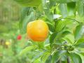
| 08/12/2002 02:41:00 AM |
New Bornby mardocheeComment: Color seems "washed" out. Composition could use some work. The fruit might be better further to the left, covering the blurred area that takes up most of the left side. Having that blurred area behind the leaves where it sort of pokes through instead of dominating and distracting could be effective. |
| 08/12/2002 03:15:00 AM |
Pocket Changeby bunniesComment: The colors of the coins might have been better showing the contrasts. This way it is sort of "flat.". The arrangement is good and the clarity of the focus. Color would have made this sort of "jump" out. |
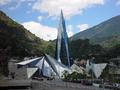
| 08/12/2002 03:28:00 AM |
alien architectby wolfjackComment: Vertical alignment might be effective here, and closer vantage point or closer cropping. |
| 08/05/2002 01:35:00 AM |
|
| 08/05/2002 02:33:00 AM |
pre-digitalby queen 91Comment: Composition seems awkward. A more irregular arrangement might have been effective--also a lighter background would have provided more contrast. |
| 08/10/2002 01:37:00 PM |
|
| 08/05/2002 01:41:00 AM |
|
| Photographer found comment helpful. |
| 08/05/2002 01:48:00 AM |
|
| 08/10/2002 01:31:00 PM |
Happy Daysby lecalanComment: Black & white really works well here. Angle of shot is great. |
Home -
Challenges -
Community -
League -
Photos -
Cameras -
Lenses -
Learn -
Help -
Terms of Use -
Privacy -
Top ^
DPChallenge, and website content and design, Copyright © 2001-2026 Challenging Technologies, LLC.
All digital photo copyrights belong to the photographers and may not be used without permission.
Current Server Time: 05/05/2026 07:52:39 PM EDT.