| Image |
Comment |
| 10/16/2002 07:33:00 PM |
Wrathby JakComment: May illustrate the theme all right, but if it was a "staged" shot some different lighting and background could probably help the overall photographic quality. |
| 10/16/2002 08:11:00 PM |
The First Sinby RichiComment: Effective composition. The bright light spot on the first apple seems distracting. Otherwise good. |
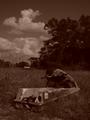
| 10/16/2002 08:01:00 PM |
GLUTTONY: "Dinner for one"by xertionComment: Expresses the theme ok. It might be that it could have been composed more effectively with a different angle, different lighting. I am assuming it was staged to some extent where you might have some control. |
 Photographer found comment helpful. Photographer found comment helpful. |
| 10/16/2002 08:50:00 PM |
Pigging Out at the Ballparkby crabappl3Comment: Meets theme well. Might be more effective cropped a little more closely to lessen the surrounding distractions and still keep enough to give the idea of the ballpark. |
| Photographer found comment helpful. |
| 10/16/2002 08:53:00 PM |
|
| 10/07/2002 01:45:00 AM |
droughtby djenanbacvicComment: Composition is interesting. A lighter tone might increase the effectiveness. |
| 10/07/2002 01:20:00 AM |
|
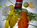
| 10/08/2002 12:56:00 AM |
Todays Dinnerby micalaurrComment: Well composed and lighted. Clarity is good. There's nothing wrong with taking an unattractive subject and improving on it for the purpose of this challenge. This shows garbage can be "artistic" in the right circumstances. Good job. |
| 10/08/2002 12:46:00 AM |
yosiby nalzComment: It might have been more effective if something had been in focus, everything appears fuzzy. Composition is pretty good. The triangular shape at the front seems distracting, however. |
| 10/08/2002 12:52:00 AM |
|
Home -
Challenges -
Community -
League -
Photos -
Cameras -
Lenses -
Learn -
Help -
Terms of Use -
Privacy -
Top ^
DPChallenge, and website content and design, Copyright © 2001-2026 Challenging Technologies, LLC.
All digital photo copyrights belong to the photographers and may not be used without permission.
Current Server Time: 05/06/2026 12:46:50 AM EDT.