| Image |
Comment |
| 02/04/2005 12:26:50 AM |
Auroraby shavenwalrusComment: great light for sure. i feel like the impact of this photo could have been helped a lot by a tighter crop, though- seems like there's too much of the thing showing. composition is a bit weak, which i think could have been fixed by a substantially closer crop. |
| 02/04/2005 12:25:33 AM |
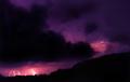
16 seconds of lightby BrooklynsbridgeComment: cooperative sky! i wish the bolts (especially those on the right) were a bit sharper. might have been worth experimenting with cropping/dodging a little bit more to bring out the details there. |
 Photographer found comment helpful. Photographer found comment helpful. |
| 02/04/2005 12:24:14 AM |
Crossing Lightby m2iwComment: blurred background is a nice touch. i also like the bold primaries. |
| Photographer found comment helpful. |
| 02/04/2005 12:22:38 AM |
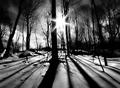
Through the Shadowsby Zap228Comment: wow, what an angle. - wide angle lens, perhaps? the sense of perspective is lovely.
sun dominates the picture a bit too much for my tastes, but i'm still giving it an 8 :) |
| Photographer found comment helpful. |
| 02/03/2005 02:30:45 PM |
Painted with fireby tristaliskComment: Greetings from the Critique Club!
Definitely the first thing that I notice about this picture is the colors. The colors are great. The range of tones in the sky is just wonderful.
Since the colors are so strong, probably the strongest aspect of this image, you want to accentuate them as much as possible and remove distractions. The bottom 1/5 or so of the image is dark and unappealing, so it doesn't belong there. Taking out that part would also (as blemt suggested) would improve the composition by taking the horizon down from its current hovering place aroudn the 1/2 mark. It would draw the focus back to the sky, where all the color and interest is.
Without doing anything other than that slight change, I think you'd have a much improved picture. Going a bit further than that (this is something for "next time," I guess), I wonder what this scene would have looked like a few seconds later, just after the sun went beyond the hills. You might not have lost anything that way, and just avoided having the burned out parts of the picture caused by the sun and its reflection. Something to keep in mind, perhaps.
Just keep taking pictures :) |
| Photographer found comment helpful. |
| 02/02/2005 08:46:43 PM |
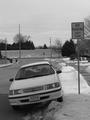
Two Wrongs Make a Right, Right?by CatbirdComment: The car on the wrong side of the road is a nice touch. Image is a bit flat and grainy, tho... I'd suggest adjusting the levels and running it through NeatImage. (NeatImage is free, btw.) |
| Photographer found comment helpful. |
| 02/02/2005 08:43:28 PM |
Ironyby PazrealComment: Nice.
Perfect example of how the title can make the image :) |
| 02/02/2005 08:43:05 PM |
|
| 02/02/2005 07:53:35 PM |
|
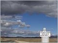
| 02/02/2005 02:49:27 AM |
On the "Route" to Seligmanby sfarrell23Comment: Great scene. I wish the sign weren't so far down in the image... hard as it is to do with such a great backdrop, the weird placement of the main element makes for a lot of dead space. maybe a wide-angle lens would have helped here? |
| Photographer found comment helpful. |
Home -
Challenges -
Community -
League -
Photos -
Cameras -
Lenses -
Learn -
Help -
Terms of Use -
Privacy -
Top ^
DPChallenge, and website content and design, Copyright © 2001-2026 Challenging Technologies, LLC.
All digital photo copyrights belong to the photographers and may not be used without permission.
Current Server Time: 05/07/2026 05:18:05 AM EDT.