| Image |
Comment |
| 01/17/2006 06:26:38 AM |
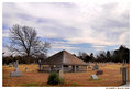
Weatheredby L1Comment: This is probably my favorite of the four photos you've posted for its texture and subtle color. I enjoy the juxtaposition of the mass of branches with the bales of hay. The trees seem a bit gray and washed out to me; if it were my image, I'd try some burning or a creative use of Multiply layers. |
 Photographer found comment helpful. Photographer found comment helpful. |
| 01/17/2006 06:23:25 AM |
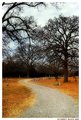
Monument to Lost Soulsby L1Comment: :D
I think the centered composition works well here. The image is already bottom heavy, and with the roofed structure dead center vertically, there is an unusually strong sense of groundedness and immobility. This resonates perfectly with the surroundings of death. I like the way your subject and composition reinforce each other. Message edited by author 2006-01-17 21:22:53. |
| Photographer found comment helpful. |
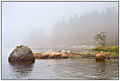
| 01/17/2006 06:21:25 AM |
Road to Perditionby L1Comment: Are you aware that "perdition" means "eternal damnation?" I'm not sure that's what you meant to say. |
| Photographer found comment helpful. |
| 01/17/2006 06:19:36 AM |
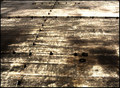
Astraphobiaby gocComment: I would never have guessed that this is a roof. It looks like most people didn't understand the link to the challenge; I don't, either. On its own merit, though, this photo is really very interesting. It abstracts wonderfully, and the detail is fascinating. |
| Photographer found comment helpful. |
| 01/17/2006 06:12:00 AM |
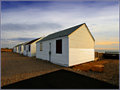
truro-motels-IMG_1577.jpgby Bear_MusicComment: The two-point perspective here is the sort of thing you see almost exclusively in line drawings. It's really interesting to see such a composition imported into photography. |
| Photographer found comment helpful. |
| 01/17/2006 05:55:15 AM |
|
| Photographer found comment helpful. |
| 01/17/2006 05:52:42 AM |
Freedomby TerramarComment: I was inspired by your picture...
I just couldn't help myself.
//www.arc.amyces.com/flying-baby.jpg
please forgive me |
| 01/17/2006 05:30:52 AM |
Eat your greens...by KelliComment: nice title. the timing on this photo is great - the bear's expression is intriguing and contemplative. it looks like the lighting was very harsh, which has the unfortunate effect of making the picture look rather flat. even so, I appreciate the artistic integrity of not dressing it up in overstated Photoshop effects. |
| Photographer found comment helpful. |
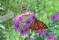
| 01/17/2006 05:23:53 AM |
Butterflies - Let's Do Lunchby CaitlynComment: I think an Auto Levels adjustment in Photoshop or the equivalent would have really improved this image. The lower part of the tonal range is completely unused, making the photo look washed out. |
| Photographer found comment helpful. |
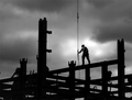
| 01/17/2006 05:20:17 AM |
Constructionby emorgan49Comment: what I wonder most when I look at this picture is, how high off the ground is he? were you standing at ground level when you took this, or were you 40 stories above the ground? I wish that there were a better sense of the surroundings in this photo. |
| Photographer found comment helpful. |
Home -
Challenges -
Community -
League -
Photos -
Cameras -
Lenses -
Learn -
Help -
Terms of Use -
Privacy -
Top ^
DPChallenge, and website content and design, Copyright © 2001-2026 Challenging Technologies, LLC.
All digital photo copyrights belong to the photographers and may not be used without permission.
Current Server Time: 05/10/2026 03:24:04 AM EDT.