| Image |
Comment |
| 04/14/2003 12:17:52 AM |
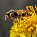
Yellow by miracComment: congratulations, Mirac! beautiful!! |
 Photographer found comment helpful. Photographer found comment helpful. |
| 04/14/2003 12:17:14 AM |
|
| Photographer found comment helpful. |
| 04/14/2003 12:16:38 AM |
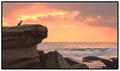
Aurora by mcmurmaComment: congratulations Mc!!! gorgeous photo...well deserved 1st place! |
| Photographer found comment helpful. |
| 04/14/2003 12:13:23 AM |
piby marboComment: very well done, marbo! congrats on the ribbon! |
| Photographer found comment helpful. |
| 04/14/2003 12:12:41 AM |
|
| Photographer found comment helpful. |
| 04/14/2003 12:11:22 AM |
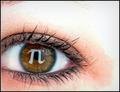
Mathematical pi by kiwinessComment: woohoo!!!! you did it again!! you're gonna be unstoppable now!! congrats, kiwi...well done!! |
| Photographer found comment helpful. |
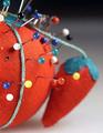
| 04/11/2003 05:03:35 PM |
Pincushionby BigSmilesComment: Greetings from the Critique Club!
I love the composition of this photo and the colors are great! I think the background is nice, but I think it would make more impact if it was a solid color.
The problem I have here is the DOF. I do love the shallow DOF, but the out of focus strawberry is distracting. My eye is drawn to it first and then the pin heads. The strawberry needs to either be the focal point or it should be moved out of the shot completely to allow the focus to be on the colors of the pins.
The pins are clear and are a nice detail. The pincushion fabric gives a nice texture. Was this cropped from a larger image where the pincushion was more centered? The pins at the top left of the image are the sharper focus. For this composition, I think dropping the focus down and a little to the right would be good.
It's a great subject and I think with just a couple of minor changes, this would be an excellent photo!
take care...
sher :)
|
| Photographer found comment helpful. |
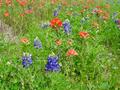
| 04/10/2003 09:00:09 PM |
Coloursby bcncrazyComment: love the orange background...it's very complimentary to all the colors shown. |
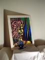
| 04/10/2003 08:59:13 PM |
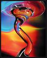
Blueby CoopGirlComment: i love the art! is this something you did? i think you had a good idea for this photo and it is very colorful. another light source to take care of the shadows on the front of the art would be a good idea and might help with the focusing. i do like the shadow at the back of the art, although i would crop out the bottom part of the photo and use more negative space at the top. |
| Photographer found comment helpful. |
| 04/10/2003 08:44:50 PM |
Complementing Colorsby kposeyComment: very pretty colors. looks a little bit out of focus and the bit of dead grass on the left is sort of distracting. |
Home -
Challenges -
Community -
League -
Photos -
Cameras -
Lenses -
Learn -
Help -
Terms of Use -
Privacy -
Top ^
DPChallenge, and website content and design, Copyright © 2001-2026 Challenging Technologies, LLC.
All digital photo copyrights belong to the photographers and may not be used without permission.
Current Server Time: 07/22/2026 08:03:38 AM EDT.