| Image |
Comment |
| 11/16/2007 02:06:37 PM |
crossed fingersby whiteroomComment: This is a really nice picture. I do enjoy it, but the framing makes not for topless in my book. |
 Photographer found comment helpful. Photographer found comment helpful. |
| 11/16/2007 01:56:00 PM |
an elephant watching a herd of gazelleby tateComment: not sure I really understand the concept of this image. I am trying to make out topless here, but only your framing makes the image topless. The wall is in nice focus and lighting though, just is not strong enough for me. |
| Photographer found comment helpful. |
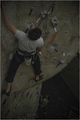
| 11/16/2007 01:50:21 PM |
Topless From the Bottom of the Earthby cloudsmeComment: Thats a fun image, nice shot of the guy with his head missing. I would like to have seen much more colour here. Boos the saturation up a bit and really make it pop. |
| Photographer found comment helpful. |
| 11/16/2007 01:47:41 PM |
Time for Teaby RulerZigzagComment: First thing I notice are the bland flat unappealing colours. They all really meld together and does not make anything look like something I would want to partake in. I don't care for this angle, maybe a bit lower would add some depth. The counter top I love it has possibility of really adding something. |
| Photographer found comment helpful. |
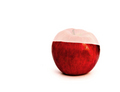
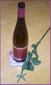
| 11/16/2007 01:46:15 PM |
Almost...by LanndonKaneComment: Interesting concept but really doesn't cut the mustard. I think maybe should have gone ahead and cut the top off and set it next to or against, the red looks nice but the fad looks horrid. |
| Photographer found comment helpful. |
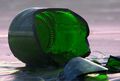
| 11/16/2007 01:43:48 PM |
topless or is it to much drinkby ThaiComment: Interesting concept, although I personally dont' care for this angle. The image also seems a bit flat to me. One thing you can try is use poster board on either side of the bottle to get even reflections, and then use one with a whole cut out for your lense in the front. I am wondering if it would have worked better with the stem in the bottle? Hmm, well try to boost the saturation ext time and a touch of levels to help make it pop. |
| Photographer found comment helpful. |
| 11/16/2007 01:41:29 PM |
Topless Bottle: Message Lostby Lickety-SplitzComment: interesting concept, but I think barroom brawl or something would have been a better concept. Traditionally messages in bottles are in clear bottles so you can see something is inside. Anyway, I would have liked to see a sharper focus on the elements in this image. It would have really helped to push it out. |
| Photographer found comment helpful. |
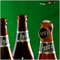
| 11/16/2007 01:38:25 PM |
Beer Pressure...by shalrathComment: Love the concept, although I would have liked the bottle in focus to be more to the left, or the other two more to the right. As well as a bit more action of the cap stead of it looking glued to the side. Nice work technically. |
| Photographer found comment helpful. |
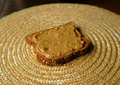
| 11/16/2007 01:37:11 PM |
PB no Jby dwainasaurusComment: So the j is the top? what if I like it the other way around? Interesting concept, although the image isn't flattering enough to make me want to eat it. |
| Photographer found comment helpful. |
| 11/16/2007 01:36:09 PM |
No Mountain Topby ShunRinComment: This image is very dark and flat. The angle is the only thing that takes away the 'top'. I would have liked to see some more contrast and levels here to really make this pop out. |
Home -
Challenges -
Community -
League -
Photos -
Cameras -
Lenses -
Learn -
Help -
Terms of Use -
Privacy -
Top ^
DPChallenge, and website content and design, Copyright © 2001-2026 Challenging Technologies, LLC.
All digital photo copyrights belong to the photographers and may not be used without permission.
Current Server Time: 07/23/2026 11:46:36 PM EDT.