| Author | Thread |
Comments Made During the Challenge  |
|
|
11/20/2007 06:10:25 PM |
Meets Challenge - 2
Technicality - 1
Creativity - 2
Biased Opinion - 1
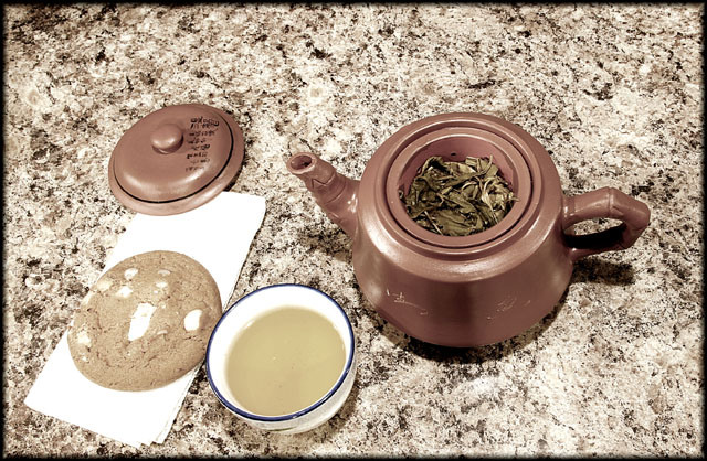
Comment - too much brown |
|
 Photographer found comment helpful. Photographer found comment helpful. |
|
|
11/20/2007 04:13:10 PM |
|
Could have pushed the tones at the deep end to give it a bit more contrast and impact |
|
| Photographer found comment helpful. |
|
|
11/20/2007 02:18:57 PM |
|
Seems a bit washed out. If thats intentional I don't know that its doing much for the pic |
|
| Photographer found comment helpful. |
|
|
11/20/2007 10:39:22 AM |
|
Shot looking down at the subject rarely work. Interesting colors though. |
|
| Photographer found comment helpful. |
|
|
11/19/2007 12:34:41 AM |
|
i like the background, it make a good background which pulls all the rest of the colors together(except for the blue teacup rim). a sweet 6 |
|
| Photographer found comment helpful. |
|
|
11/16/2007 03:18:43 PM |
|
Clarity of details...GREAT! |
|
| Photographer found comment helpful. |
|
|
11/16/2007 01:47:41 PM |
|
First thing I notice are the bland flat unappealing colours. They all really meld together and does not make anything look like something I would want to partake in. I don't care for this angle, maybe a bit lower would add some depth. The counter top I love it has possibility of really adding something. |
|
| Photographer found comment helpful. |
|
|
11/16/2007 10:02:25 AM |
|
What ever you used as a backround is very distracting to me. your lighting also seems a little harsh on the left of the cookie. |
|
| Photographer found comment helpful. |
|
|
11/15/2007 09:04:21 PM |
|
Nice idea and comp but the granite background seems a bit busy |
|
| Photographer found comment helpful. |
|
|
11/15/2007 07:56:29 PM |
|
it has a weird point of view? maybe better with a different angle |
|
| Photographer found comment helpful. |
|
|
11/15/2007 06:58:43 PM |
|
nice use of saturation. I like the simplicity. |
|
| Photographer found comment helpful. |
Home -
Challenges -
Community -
League -
Photos -
Cameras -
Lenses -
Learn -
Help -
Terms of Use -
Privacy -
Top ^
DPChallenge, and website content and design, Copyright © 2001-2026 Challenging Technologies, LLC.
All digital photo copyrights belong to the photographers and may not be used without permission.
Current Server Time: 06/29/2026 10:17:13 PM EDT.