| Image |
Comment |
| 11/16/2007 02:43:44 PM |
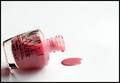
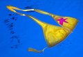
The Cauchy boundary condition:by taseComment: I personally see many tops to this image. Its a nice texture that and vanishing point but I can not make the connection to topless. |
| 11/16/2007 02:42:29 PM |
Oh NO!by CJinCAComment: This is nice, although I don't care for the angle, the spot looks awkward. it just looks out of place. |
 Photographer found comment helpful. Photographer found comment helpful. |
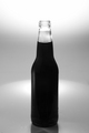
| 11/16/2007 02:20:23 PM |
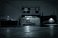
Blew His Lidby vandoornbuddhaComment: Nice concept but the dark on grey is really bland to me. Also the title is blew.. I would have enjoyed some nice action here, something that really gives me a sense of blew. |
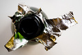
| 11/16/2007 02:18:51 PM |
Bubbly!by spencerwoodComment: interesting concept, but maybe if the title is bubbly that we could see some bubbles foaming out over the top or something as fun. even though this technically looks nice on the metal the rest is just boring and bland to me. |
| Photographer found comment helpful. |
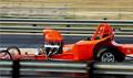
| 11/16/2007 02:17:40 PM |
Ridin With The Top Downby amjltComment: fun image, however it doesn't hold strength for me in this challenge. Also it seems a bit, pixely a little muttled, not sure what that is. |
| Photographer found comment helpful. |
| 11/16/2007 02:14:53 PM |
An embarrassing moment at the poolby rmezzoComment: fun concept, however I would have liked to see a wider shot and maybe a foot or something in the image as well. Something to give me more of a feel stead of a stray top floating in the water. |
| Photographer found comment helpful. |
| 11/16/2007 02:14:12 PM |
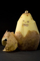
Peeled like a potatoby hajekaComment: As fun as this image is, there is still a top on the guy. I enjoy the concept, just not for this challenge. The lighting is nice and well done. There is a stray hair though. |
| Photographer found comment helpful. |
| 11/16/2007 02:13:07 PM |
The one that blew its top.by jprezantComment: This is a nice fun image... although I would have liked a bit more focus, it seems the egg next to the topless egg on the left is the one in the clearest focus. Thats because the shell is so narrow its easily missed to have the focus. Nice idea. |
| Photographer found comment helpful. |
| 11/16/2007 02:11:44 PM |
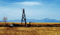
To Much Windby vtruanComment: Fun image, I would have liked the tower a bit more to the left, more 1/3 of the image. it is an enjoyable image. But looks more burnt then windblown. |
| Photographer found comment helpful. |
| 11/16/2007 02:08:59 PM |
Pumpsby visionistComment: hmm, i am trying hard to see this here, I really don't understand the concept or what exactly is topless. its a fine image as it is, but just doesn't fit strong enough for me. |
| Photographer found comment helpful. |
Home -
Challenges -
Community -
League -
Photos -
Cameras -
Lenses -
Learn -
Help -
Terms of Use -
Privacy -
Top ^
DPChallenge, and website content and design, Copyright © 2001-2026 Challenging Technologies, LLC.
All digital photo copyrights belong to the photographers and may not be used without permission.
Current Server Time: 07/23/2026 09:08:32 PM EDT.