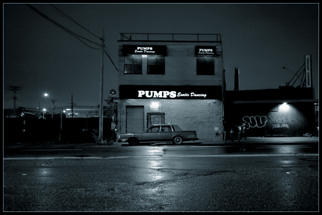
I think that this was the best shot in the challenge. For all the people that said it doesn't meet the challenge requirements: the subject of the photo is "topless". Its a building that holds a bunch of topless things. I think it works fine but everybody that didn't is just taking things too literal and wants to see a snapshot with the top of something cut off. I love the cool tones too.
hmm, i am trying hard to see this here, I really don't understand the concept or what exactly is topless. its a fine image as it is, but just doesn't fit strong enough for me.
A tighter crop would have been better, although this conveys "with no people" even better. It is only hard to see the 'erotic dancing' so quick voters may not get it...
Ah, genius! Took me a second, but what a refreshingly creative, original take on the challenge. I do like the shot, but I'm feeling like the composition seems a little uncomfortable. The space at the left of the frame doesn't seem to really contribute anything to the image, I'm wondering if a little tighter framing, losing some of that area could make the photo stronger? The little building with the light and grafitti at right fits in fine I think. Cutting out the left area would also put the main subject out of the center, which, although I think it does work here centered, might work even better offset. Ok, I held some paper up, cropping on the left right up to about the telephone pole, and the bottom up a little to before the white line, and I would definitily say it looks stronger to me :-) But, like I said, great idea, I like it very much, oh, and that towncar in front really makes the shot complete!







 Add photograph to your favorites
 Add photographer to your favorites


 Photographer found comment helpful.


