| Image |
Comment |
| 05/02/2007 12:02:39 AM |
Light Danceby sfaliceComment: Looking at the thumb it has a real matrix type feel, even bigger it is still there just not has prevalent. I really enjoy the effect here on everything except the 'fortuitously shaped tree'. I think the white around the dots there really throws off the image and makes it look like a glob that was just dropped there.
Minus the tree, I really enjoy the rest of the image, the vanishing point is great, and I can really see a ton of uses for if. Nice work, I enjoy to see people pushing the boundaries a bit. |
 Photographer found comment helpful. Photographer found comment helpful. |
| 05/01/2007 11:46:23 PM |
Early for Halloween?by sfaliceComment: This is a very interesting image, I have mixed feelings about it. I find it very intriguing, and it lulls me in, but I think maybe the jagged background throws me into a differ direction. It takes my eyes off the 'ghost' and into the bland corner. I am also wondering what this may look like with a little more contrast. Well maybe not levels, but selective colour and richer blacks and lighter whites. It is a very fun image. That pop of green is nice, I think im just wishing for the background to be cleaner. |
| Photographer found comment helpful. |
| 05/01/2007 11:41:26 PM |
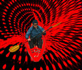
Vortexby sfaliceComment: A Really fantastic idea, but first off, unless you are planing on trying to sell the image or the person wanted you to Hide their ID, you really didn't have to. And blocking out the eyes is normally good enough, I think the blurred face is a major distraction as is the glob on his head.
I think the net came out very nicely, I would have to think about the kayaker, that you should have changed perspective of him. You see how the net comes together more on the right side? I would have placed him at an angle there, as though he is coming out from the side and not straight at you. I think that would have given a much more dramatic feel. I also think you might change the lower paddle a touch to maybe make it feel like he is 'in' the net paddling through it, instead of just floating on top.
I like the idea and the red colour goes good, but it doesn't have a dramatic enough feel. Try changing the perspective and see how the feel of the whole image changes. |
| Photographer found comment helpful. |
| 05/01/2007 09:54:32 PM |
by arsenalComment: This is fantastic, I really enjoy this image. Normally I really don't care for split images similar to this style, but this really has some dramatic elements intertwined with it. The textures/brushes you use came out wicked sweet, I think you did a really great job.
I only see two things I question, The main image they appear to be kissing, but look like they are faking it. Not sure exactly if that was what you wanted, but to me, I would like to see a more natural posture to them. In the sidebar, It looks as though she is clocking him in the jaw... if that is the effect you desired it came out, if not, might want to watch hand positions, they are one of the more difficult elements to control with a model. Overall you did a really great job. |
| Photographer found comment helpful. |
| 05/01/2007 07:35:34 PM |
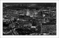
Day-1by SandyPComment: nice cityscape, the focus is just amazing. I think I just don't care for the bright tower in the center, kind of distracts me from the rest of the image. |
| Photographer found comment helpful. |
| 05/01/2007 06:41:32 PM |
Day 1by eamurdockComment: This is a really great shot, I really enjoy the dramatic feel of it, and I also like that you used this tonal quality as apposed to traditional b/w. Very nice. |
| Photographer found comment helpful. |
| 05/01/2007 06:39:01 PM |
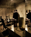
Office.jpgby weegi70Comment: I love the angle, but I think this would be uber fantastic if it had a lot more dramatic contrastiness with it. |
| Photographer found comment helpful. |
| 05/01/2007 06:38:14 PM |
one.by xantangummiComment: Hmm, I think the left is a bit blown out, not too contrasty, as is the right. Not really sure what to say, neither really stirs me one way or another. it also appears to be two different models... which I think it would have been better effect if there was only a single model for both sides in the different look. |
| Photographer found comment helpful. |
| 05/01/2007 06:30:01 PM |
Day 1 - Phone Callby meneleComment: I love the concept here and you did good with positioning, just wish someone was in the other side, very nice image. |
| Photographer found comment helpful. |
| 05/01/2007 06:28:53 PM |
crisisby boysetsfireComment: nothing at all bad to say, this shot is just... perfect. |
| Photographer found comment helpful. |
Home -
Challenges -
Community -
League -
Photos -
Cameras -
Lenses -
Learn -
Help -
Terms of Use -
Privacy -
Top ^
DPChallenge, and website content and design, Copyright © 2001-2026 Challenging Technologies, LLC.
All digital photo copyrights belong to the photographers and may not be used without permission.
Current Server Time: 07/25/2026 04:16:34 AM EDT.