| Image |
Comment |
| 05/28/2007 10:06:58 AM |
day 02by FirstyComment: This is an interesting shot, however I feel there is too much extra bike showing. I think it really distracts from the image. Maybe a sharper angle, or closer in... You did do a terrific job with all those reflective surfaces. |
 Photographer found comment helpful. Photographer found comment helpful. |
| 05/28/2007 10:05:18 AM |
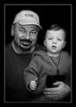
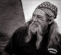
Day One: F & Sby Art RoflmaoComment: This is a rally interesting shot. I think the eyes make the total connection here. The contrasts between the darker and lighter skins is really interesting and creepy. This image has an 'older' type feel to it, and no offence... but made me think of a kidnapper showing off for the parents.. 'Here's your Brat.. now Pay Up!' L()L |
| Photographer found comment helpful. |
| 05/28/2007 10:01:26 AM |
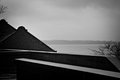
Lake.jpgby eamurdockComment: I enjoy the contrasts of shapes here. However, I think a bit more contrast between light and dark would really make this image stand out. |
| Photographer found comment helpful. |
| 05/28/2007 10:00:36 AM |
Day 2by TDCollinsComment: This is a nice image, however, it just seems to be missing something for me. Can't put my finger on it, but it seems... incomplete. |
| 05/09/2007 09:38:28 AM |
|
| Photographer found comment helpful. |
| 05/05/2007 01:33:18 PM |
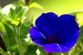
Blue and Greenby rdlorfComment: From the Critique Club
How are you doing today? I am going to touch on a few items with your image.
Colour;
The colour here is really nice, I enjoy the hint of purple within the blue and the blue flower really pops out nicely from teh yellow/green background. The colour is very nice I don't think I have anything bad to say about it.
DOF/Focus;
I think this image itself goes nicely with a shallow dof, however, I find myself wondering what it would be like if the focal point was more in the center of the blue flower instead of the edge. Also being for the rules of third challenge, I would assume the stronger focal point would be within the rules suggestions. Also I keep wondering if those are little stems inside the flower or if its just empty? I do think a change of focal area would definitely improve the overall image.
Post;
I think the post was selected very sparingly and works mostly, the bright spot on my upper left is a bit of a distraction and I wonder what a white adjustment might do? if it would change it to drastically? You did a good job here in post.
Off Items;
As stated above the white spot and also the focal point are off to me. Also as the focal point is on the edge of the flower, the idea of the rules of thirds does not hold very strong for me. Also I may have moved the frame of the flower a bit to the right to be more in a 1/3 position. Not much just a touch.
Other;
I think you did a really good job here and the very nice colour is your strongest point here. I think with playing around with focal points and composition you will really do well with your images.
Nice Job
Andrew 'littlegett' |
| Photographer found comment helpful. |
| 05/05/2007 01:23:23 PM |
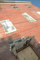
Boards and shardsby boyhuntsforblissComment: From the Critique Club
How are you doing today? I am going to touch on a few items with your image.
Colour;
Personaly for me the colour seems a bit flat. It could be the combination of the old wood and white matching the grout a bit that gives the flater colour. I think maybe having an older feel to the brick might really enhance the overall colour.
DOF/Focus;
It seems this area is doing really well, everything seems to be in focus and the angle fades off nicely. But, I am wondering though what would happen if you used a more shallow dof, and focused on something more in the 1/3rd spirit.
Post;
simple post was done for the basic challenge, and I am wondering what this may have looked like if you pushed it a bit farther with levels or curves.
Off Items;
The bright spots on the wood covered windows is a major distraction for me, as sis the tiny bit of blue sky in the corner. Also, to me, there is not a clear focal point and it doesn't really tell me the rules of thirds was used.
Other;
I am thinking, what if you cropped it down so the sky is not showing, upped some curves to give a deeper colour to the bricks, and use a shallow dof to really focus in on one aspect of the image in one of the 1/3 quadrants. I think this has a lot of potentional and I do enjoy the angle and such.
Nice Job
Andrew 'littlegett' |
| 05/03/2007 09:08:28 PM |
|
| Photographer found comment helpful. |
| 05/03/2007 09:07:13 PM |
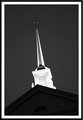
Day 2 B&Wby KatmystiryComment: I like the angle but I think it would really have popped more if the top could be made out better instead of just the crossbar. |
| Photographer found comment helpful. |
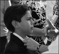
| 05/03/2007 09:04:09 PM |
Some Adviceby robgs57Comment: Its funny, it doesn't look like advice, more of a scolding. That finger waging in his face and he is just taken it like nothing matters. You have nice contrasts and tones here. Only problem I see is the sun spot on the top of the ladies chest behind your nephew. |
| Photographer found comment helpful. |
Home -
Challenges -
Community -
League -
Photos -
Cameras -
Lenses -
Learn -
Help -
Terms of Use -
Privacy -
Top ^
DPChallenge, and website content and design, Copyright © 2001-2026 Challenging Technologies, LLC.
All digital photo copyrights belong to the photographers and may not be used without permission.
Current Server Time: 07/26/2026 12:45:19 AM EDT.