| Image |
Comment |
| 05/28/2007 10:28:29 AM |
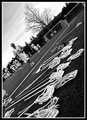
Silent-Sticks (Day 2)by cryanComment: This is an interesting perspective... but not quite sure it works for me. I think it may have worked better 90Degrees CW... hmmm |
 Photographer found comment helpful. Photographer found comment helpful. |
| 05/28/2007 10:27:15 AM |
family3.jpgby electrolostComment: interestingly creative shot, I think the textures and stuff really add to a nice mood for this image. |
| Photographer found comment helpful. |
| 05/28/2007 10:26:16 AM |
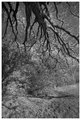
__by undieyatchComment: I enjoy the creepy branches here. But, the rest leaves me at a loss. |
| 05/28/2007 10:25:26 AM |
|
| Photographer found comment helpful. |
| 05/28/2007 10:24:00 AM |
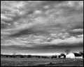
White Barnby HipychikComment: very interesting image, I think the biggest fault is the front of the building being blown out. I think if it had a shade like the side, It still would have stood out, but not been an eyesore. The clouds are really fun, I wonder what a touch more contrast would bring? |
| Photographer found comment helpful. |
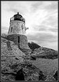
| 05/28/2007 10:22:03 AM |
Day 2 - Castle Hill Lighthouseby CapeSailComment: I think the sky needs to be processed separately from the rest of the image. For me, the sky is blown out, but the rest is still kinda flat. |
| Photographer found comment helpful. |
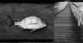
| 05/28/2007 10:20:30 AM |
Fishby RetroesqueComment: Personally, I don't care for this 'double' image. They just don't seem to be connected enough for me. And the angle of the pier just really feels, incomplete. The fish itself is fairly fun, Although I think I would have liked more contrast between his face and plank, as it is now, it seems to get lost. |
| Photographer found comment helpful. |
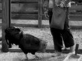
| 05/28/2007 10:15:04 AM |
Day 2 - Feeding Timeby bdennyComment: L()L at first glance it looked like the rooster was in attack mode and going for the toes L()L. Its a fun image, but I think I would have liked to see the action fully stopped without the motion blur. Also, maybe a little bit tighter crop on both sides. Fun stuff all the same. |
| Photographer found comment helpful. |
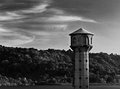
| 05/28/2007 10:13:18 AM |
Birds of the Lakeby jdannelsComment: I would move the lighthouse to the right just a bit more. I enjoy the lighthouse itself, however, the background is what really leaves me flat for this image. For me, it just doesn't seem to hold it together as well as it might... I am wondering, what if hillside was lighter I think that would bring out the lighthouse quite a bit more. |
| Photographer found comment helpful. |
| 05/28/2007 10:11:02 AM |
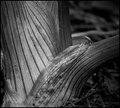
Day 2 - B&W Challengeby alexjackComment: interesting perspective. one thing I notice, is the bright spots of moisture? Items like that are always my trouble... just doesn't feel right ya know? I think what it is, is that they are so bright, if you try to add more contrast, they really blow out, while everything else is still kinda flat... I enjoy the idea, and wonder what the colour version would look like. Maybe, next time, take a sheet of white paper and help de-fuse the flash a bit... sometimes it helps. |
| Photographer found comment helpful. |
Home -
Challenges -
Community -
League -
Photos -
Cameras -
Lenses -
Learn -
Help -
Terms of Use -
Privacy -
Top ^
DPChallenge, and website content and design, Copyright © 2001-2026 Challenging Technologies, LLC.
All digital photo copyrights belong to the photographers and may not be used without permission.
Current Server Time: 07/25/2026 12:21:57 PM EDT.