| Image |
Comment |
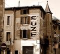
| 07/15/2004 12:40:39 AM |
The Camelia Bazarby jjbeguinComment: I'm not too keen on the building looming into the frame on the left, but the central third of this shot is my favorite of the challenge. Great duotone reductionand nice balance between the curves and the rectalinear forms, but I think it would have been stronger cropped up and right. |
 Photographer found comment helpful. Photographer found comment helpful. |
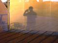
| 07/14/2004 07:55:22 PM |
Enjoyby film_de_verreComment: nice shot but look up the tutorial on posting to the size limit. More pixels make more points in the scoring. |
| Photographer found comment helpful. |
| 07/14/2004 07:53:23 PM |
Fieryby DoMoreiraComment: A show stopper of an image that has, as far as I can tell, nothing to do with the challenge. I love the forms, colors and play of light here, and this shot will be a nice addition to your portfolio, but why enter it in this challenge? |
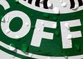
| 07/14/2004 07:29:57 PM |
Global Rip-...by BeeGeeComment: 2 knocks on this shot. 1). not a fan of corporate coffee king, but no points off there. 2) . challenge said ..."complete words -- not just individual letters -- play "... and what we have here is individual letters, not a word or words. You didn't meet the challenge. This is a nice crisp well composed well lit shot, but that is only half the battle, ya gotta point your camera at something that meets the challenge. |
| Photographer found comment helpful. |
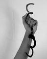
| 07/14/2004 01:48:43 PM |
I'm free!by dr rickComment: Good idea but the straight line & centered composition hurts the shot |
| Photographer found comment helpful. |
| 07/14/2004 01:47:21 PM |
Freedom IIby cimarron98Comment: This shot looked like the winner in thumbnail, but it is too softly focused in the lower half, and that odd vein in the wall (which is in perfect focus ) keeps drawing my eye away from the subject. Almost there. |
| Photographer found comment helpful. |
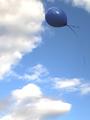
| 07/14/2004 01:42:39 PM |
Let Goby ElemmennopeComment: I like th iconograph here, and also the framing, but the blue balon against the blue sky lacks visual pop. The edges look soft and the ribbon fades in and out of visibility. Very close to being a top pick. |
| Photographer found comment helpful. |
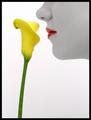
| 07/14/2004 01:32:16 PM |
Smell The Flowersby Spanish_GreaseComment: Lovely desat shot but if I were to list all the word that came into my head to describe this shot I think I would get half way through the dictionary before I got to the word freedom. IMHO you missed the challenge but got a shot that would ribbon in many other challenges. |
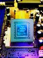
| 07/08/2004 12:24:32 PM |
It's What's On The Inside That Countsby C-town driverComment: Well lit but the DOF is too short for this sort of shot. Either make everything in the shot razor sharp, or tighten it up so the product is the only thing in focus, as it is with the foreground in and the backround out the eye tends to bounce around a bit too much. It is a small quible in a good overall shot. |
| Photographer found comment helpful. |
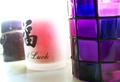
| 07/08/2004 12:20:49 PM |
Too Hot to Candle!by BearSilberComment: Pretty shot, but too soft and not product specific for this challenge. Nice color grouping, might be better in the other challenge "purple" as it is the color palate that I like best here. |
| Photographer found comment helpful. |
Home -
Challenges -
Community -
League -
Photos -
Cameras -
Lenses -
Learn -
Help -
Terms of Use -
Privacy -
Top ^
DPChallenge, and website content and design, Copyright © 2001-2026 Challenging Technologies, LLC.
All digital photo copyrights belong to the photographers and may not be used without permission.
Current Server Time: 07/17/2026 12:36:20 PM EDT.