| Image |
Comment |
| 04/08/2009 03:39:49 PM |
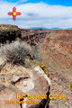
Rio Grande Gorgeby chefsamComment: The hard, flat mid day sun really works against you here, but the subject matter is dead on, and I love the graphic and type. |
 Photographer found comment helpful. Photographer found comment helpful. |
| 04/08/2009 03:33:30 PM |
|
| Photographer found comment helpful. |
| 04/08/2009 03:30:26 PM |
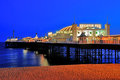
Brightonby marboComment: The vivacity of the colors in the sky and on the sand seem to leach a bit of the life from the lights of the pier, sapping some of the energy of this very nice shot. the subject matter and framing are dead on, but they eye gets pulled away from the main focus. |
| Photographer found comment helpful. |
| 04/08/2009 03:24:43 PM |
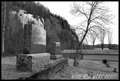
Signed the Reaperby drewhosickComment: now this one made me laugh!
on the technical side i wish you had a true black in the frame, it just seems a bit flat. |
| Photographer found comment helpful. |
| 04/07/2009 12:29:04 PM |
Coryby JuliBocComment: It is said that a burden shared is a burden lightened, I'm not sure the same can be said about the pain of loss. I hope it can help that we have shared some of your loss through these lovely images, and you good words, perhaps in sharing , you can lighten your load. |
| Photographer found comment helpful. |
| 04/07/2009 03:09:34 AM |
Flawlessby raishComment: I think this is a bit of a cheat. Some of your other brown ribbons have had better wit and displayed a more subtle response to the challenge than this, and yet you carry off the hardest of all browns with pure technique? tisk tisk tisk. |
| Photographer found comment helpful. |
| 04/07/2009 01:48:45 AM |
|
| Photographer found comment helpful. |
| 04/06/2009 02:56:02 PM |
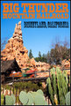
Big Thunder Mountain, Disneyland, CAby bspurgeonComment: There are alot of entries in this challenge that are better photographs than postcards, this is the opposite. Its a shame that the train is quite so blured, some helps, but this is too much (IMHO). That said everything else , especially the typography is prefect. top ten. |
| Photographer found comment helpful. |
| 04/06/2009 02:51:16 PM |
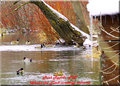
Park Rapids, MNby PikkelComment: I'm not sure why you included the element on the right, but it is distracting without giving me much of a clue as to location. also the OOF twig on the right doesn't help. Challenges like this are tough when you don't live near a major tourist attraction, but A bit more thoughful framing would help. |
| 04/06/2009 02:46:36 PM |
My placeby Delta_6Comment: This is a lovely exposure, but it think it would have looked more "postcard-like" if you had gone for the 4x6 proportions rather than this more squared up crop. That and the blown center on the ferris wheel are the only knocks on this fine image. |
| Photographer found comment helpful. |
Home -
Challenges -
Community -
League -
Photos -
Cameras -
Lenses -
Learn -
Help -
Terms of Use -
Privacy -
Top ^
DPChallenge, and website content and design, Copyright © 2001-2026 Challenging Technologies, LLC.
All digital photo copyrights belong to the photographers and may not be used without permission.
Current Server Time: 07/22/2026 09:29:02 AM EDT.