| Image |
Comment |
| 05/30/2004 08:30:09 PM |
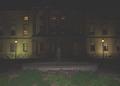
Province Houseby zeke123caComment: The darkness in the middle of the building really hurts this. Without bringing huge lights, the only thing I could think of was to lengthen the exposure (which might also make the fountain more interesting) and trade off the center for the sides being a little over exposed. |
 Photographer found comment helpful. Photographer found comment helpful. |
| 05/29/2004 07:09:53 AM |
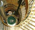
Lunch for Twoby TallblokeComment: This is a great idea, but, the people on the next level down should be off camera. At first glance, I thought the photo was about them, and it wasn't until I stared a bit that I understood this scene and why the view was so unusual. |
| Photographer found comment helpful. |
| 05/28/2004 08:43:19 PM |
Egg, brown or white?by cabaComment: I thought this was one of the coolest compositions in the challenge. It was also one of the few times that I liked a photo that had hightlights that clipped, but I did. Nice shot. |
| Photographer found comment helpful. |
| 05/28/2004 08:41:38 PM |
Don't Fret There's Multiple Lightsby BooZonComment: This could be a little sharper all around, and the strings are a little overexposed or over processed in some ways. On the upside, I really like the way you created shadows along the outside of hte guitar's body. Perhaps the same light setup with slightly diffused lights would help. |
| Photographer found comment helpful. |
| 05/26/2004 08:15:41 PM |
Escaping Lightby gpgeminiComment: I liked the idea, but thought the lights were a bit overexposed, which resulted in an average score from me. |
| 05/26/2004 07:46:46 PM |
lightobject1by MattOzComment: I like the main subject, and its placement in the composition, but the extra shadows are distracting a bit. |
| 05/26/2004 07:45:40 PM |
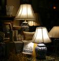
Store Windowby digitaldaveComment: I thought the use of the multiple lights as a subject was clever in this case, as it gives some real interest and depth to the photo. The composition was just a touch too busy for me to really enjoy, |
| Photographer found comment helpful. |
| 05/26/2004 07:43:15 PM |
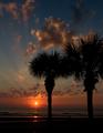
Florida Sunriseby GallatinComment: This is a great photo that I really like, but I didn't think met the challenge very well. There is really only a single light source in the picture. |
| Photographer found comment helpful. |
| 05/26/2004 07:41:07 PM |
AF 75-300mm Kaleidoscopeby JoelHSmithComment: I really like the idea here, and the lens seems to be perfectly done. However, the camera body seems a little flat, so some lighting to improve the texture on the camera itself would make this a great shot rather than good. |
| Photographer found comment helpful. |
| 05/26/2004 07:38:27 PM |
Paradise by Candlelightby doveyComment: This is a great idea, and would have scored hire, except for the lights, as they are clearly staged. They distract greatly. The palm branch in front is a great effect and makes the scene seem to be not so staged. -7 |
Home -
Challenges -
Community -
League -
Photos -
Cameras -
Lenses -
Learn -
Help -
Terms of Use -
Privacy -
Top ^
DPChallenge, and website content and design, Copyright © 2001-2026 Challenging Technologies, LLC.
All digital photo copyrights belong to the photographers and may not be used without permission.
Current Server Time: 06/11/2026 09:43:10 PM EDT.