| Image |
Comment |
| 09/11/2005 11:49:28 AM |
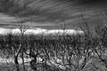
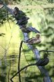
Young Branchby TwylaComment: This has good DOF. I think if the lighting were better, this would really have some impact. I like the comparison of the old and new, but it lacks emphasis as the lighting is maybe too low. |
 Photographer found comment helpful. Photographer found comment helpful. |
| 09/11/2005 11:48:40 AM |
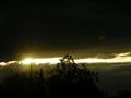
Reach for the Skyby MattBComment: Are these mangroves? I love their spindly "fingers" against the cirrus clouds. Interesting perspective. I like this. 8 |
| Photographer found comment helpful. |
| 09/11/2005 11:47:44 AM |
Branch of Light!by AzCKellyComment: Pretty - nice use of negative space. This has a lonesome feel to it and I appreciate the originality of the shot. |
| Photographer found comment helpful. |
| 09/11/2005 11:47:17 AM |
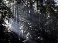
Rays Thru Redwood Branchesby StangComment: This has great potential. I think I'd work on curves and contrast so that it really POPs out at you. I love the rays through the trees. 7 |
| 09/11/2005 11:45:42 AM |
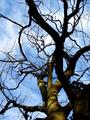
... TwIsTeD ...by stphqComment: I like the dappled light on the trunk. The sky is lovely. I'd work on the curves a bit, maybe darken up the trunks even more to an almost silhouette. |
| Photographer found comment helpful. |
| 09/11/2005 11:44:36 AM |
Sleeping Ducksby mistertocComment: I think I'd zoom in on just a few of them to showcase their beautiful colors and detail. I like the idea of this. Maybe work on the focus a tad as well. |
| 09/11/2005 11:43:47 AM |
Submergedby InnaNComment: This has a lonesome sense to it. It might be fun to play with black and white and see if the the branches really POP out of the water more. I'd straighten the horizon too, as it looks tilted and down to the right a bit. This definitely has potential. ;~D |
| Photographer found comment helpful. |
| 09/11/2005 11:42:42 AM |
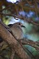
Dove Branchby FotoMunkiComment: Very sweet. Doves have such a beautiful presence. I like the DOF. Maybe crop out part of the blurry big branch to the left. The colors are nicely done. I'd zoom in on the bird a bit more. 7 |
| Photographer found comment helpful. |
| 09/11/2005 11:41:57 AM |
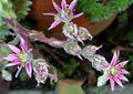
Bursting Outby dphillipsComment: I really like the DOF of this. IT seems slightly out of focus - maybe it's my old eyes. LOL Nice colors and the contrast of the pink and green give it some pop. 7 |
| Photographer found comment helpful. |
| 09/11/2005 11:41:21 AM |
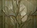
Nature Garden Artby trainComment: This shot has great potential. Since the color of the fence doesn't add anything to the shot, I think I'd go with black and white, boost the contrast and those wonderful spider webs would really POP. The light is well done to showcase them with the existing monochromatic theme. 7 |
| Photographer found comment helpful. |
Home -
Challenges -
Community -
League -
Photos -
Cameras -
Lenses -
Learn -
Help -
Terms of Use -
Privacy -
Top ^
DPChallenge, and website content and design, Copyright © 2001-2026 Challenging Technologies, LLC.
All digital photo copyrights belong to the photographers and may not be used without permission.
Current Server Time: 06/20/2026 03:16:48 AM EDT.