| Image |
Comment |
| 09/17/2005 10:16:58 AM |
Nakia IIby banmornComment: She is lovely and the lighting is nicely done. I think I might have used a little post editing to soften some of the imperfections in her skin and still left it with a natural feel. The bricks create a monochromatic theme with her dark skin tones, but I'm thinking either a black solid background or possibly a white one would really give this some more punch since the pattern is a bit distracting from her face. |
 Photographer found comment helpful. Photographer found comment helpful. |
| 09/17/2005 09:24:49 AM |
Cat Ba Island, Vietnamby clennyComment: The simple blue and black work so well. The intensity is great. I like the composition and your "down on the ground" sense. Very pretty! |
| 09/17/2005 09:22:10 AM |
rainflower.jpgby clennyComment: Very pretty. The vibrance of the pinky red is wonderful. I like the droplets not only on the flower but coming down. Well done!! |
| 09/17/2005 09:20:03 AM |
Pensive Cowgirlby BeagleboyComment: Great depth of field. Is this a rule of thirds reject? I like her gaze - makes you wonder what she's thinking and looking at. |
| Photographer found comment helpful. |
| 09/17/2005 09:19:17 AM |
Rising Aboveby printer4uComment: Just love hot air balloons. This is great with several speckled throughout the sky amidst a glorious setting with the reflection! Super composition. The colors are terrific. My one critique would be to possible straighten out the horizon, but otherwise a wonderful shot! |
| Photographer found comment helpful. |
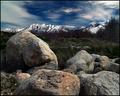
| 09/17/2005 09:18:07 AM |
Mount Olympusby dsidwellComment: How did I miss this? It is amazing. The composition is perfect. The rocky foreground with it's roundness makes for a great grounding force for the peak of the mountain. Lovely colors too - so rich! This is one you can study for a long time. Aaaah! What a joy. |
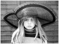
| 09/17/2005 09:13:39 AM |
hat bw.jpgby xtineComment: I like her non-expression with that oversized hat! Different. I like it very much in black and white as well. What if you really upped the contrast? Maybe it would distort, but it's just an idea. Also, I'd like to see her less centered in the shot - maybe with some more space on either side. In a perfect situation, the backdrop would be solid, but I still like this shot very much. |
| Photographer found comment helpful. |
| 09/16/2005 09:41:58 PM |
|
| 09/16/2005 09:32:51 PM |
Paradoxby Spanish_GreaseComment: ROFL This is hilarious. Whoever posed - I give him mega credit.
Actually, I like this very much. The composition and duality of it is excellent! Fun - thanks for the smile. |
| 09/16/2005 04:48:26 PM |
BW film developerby birgirComment: Greetings from the Critique Club@@@
First of all, let me congratulate you on your originality and imaginative take on the challenge. I think the white skin with the black film wrapped around certainly suits the challenge. The natural wrapped in the man-made even creates the contrast on a 2nd level. The composition is great. The shadowing under the body adds to the contrast. The curl of the film adds a fun nuance to the overall abstract sense of the shot.
My main critique would be that the image is just too small. You could have 640 as your largest pixelation and could make it up to 150 kb as well, so it would make for a much crisper, impactful image.
I look forward to seeing more of your work in the future! Judy |
| Photographer found comment helpful. |
Home -
Challenges -
Community -
League -
Photos -
Cameras -
Lenses -
Learn -
Help -
Terms of Use -
Privacy -
Top ^
DPChallenge, and website content and design, Copyright © 2001-2026 Challenging Technologies, LLC.
All digital photo copyrights belong to the photographers and may not be used without permission.
Current Server Time: 06/21/2026 01:56:33 AM EDT.