| Image |
Comment |
| 09/21/2005 09:27:16 AM |
simpleby nidnodComment: Pretty and subtle. I almost wsth the lighting were a bit more intense, with the soft filter and all but maybe that's my personal taste. I wonder if it would have worked a bit better with a solid background, and not one with folds and movement. I love the rich magenta of the flowers and the single leaf. |
 Photographer found comment helpful. Photographer found comment helpful. |
| 09/21/2005 09:25:18 AM |
Blurby cwalmyeComment: Nice long exposure. I wish the colors were a bit more vivid. It would really have some pinache then. I love bicycles. They have a curved AND straight sense to them. Very graphic. |
| Photographer found comment helpful. |
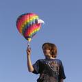
| 09/21/2005 09:24:40 AM |
Do I know you?by MarkComment: Great idea. The lighting seems a tad harsh with her face in the shadows and she's squinting. I wish her shirt weren't so distracting, with the detailed design and all. I like the balloon. It would have been cool to shoot it so that she is only a silhouette. Original idea though. |
| Photographer found comment helpful. |
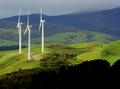
| 09/21/2005 09:23:39 AM |
3 to the power of Thirdsby KiwiShotzComment: This is interesting and I like the rolling hills with the complimentary blues and greens
This actually works both horizontally and vertically. The white of the wind mills draw your eye to them. Nice. |
| Photographer found comment helpful. |
| 09/21/2005 09:22:49 AM |
Wisdom in the Eyes of a Street Vendorby twm122Comment: Great skin tones and the nice reflection on her face is pleasant. It does have a snapshot sense to it thought with the distracting items in the background. It suits the challenge well. This might be a fun study in Black and White as well. |
| Photographer found comment helpful. |
| 09/21/2005 09:21:04 AM |
waitingby muckpondComment: Clever. I like the highlights on the hair and her pensive looe. This has a good use of black and white. Maybe upturned eyes would have worked a bit better for me. |
| Photographer found comment helpful. |
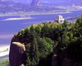
| 09/21/2005 09:19:18 AM |
Crown Pointby ace flymanComment: Good use for the challenge but way overexposed. The blanched out water and background has lost most of it's color due to the time of day probably. I love the rich tones of the foreground. Maybe shoot in early morning or late evening and you'd really have something. ;~D |
| Photographer found comment helpful. |
| 09/21/2005 09:14:27 AM |
odd beeby speaseComment: Nice DOF. I like the bee's placement - perfect for the rule of thirds. I think the colors are very nice too. It's interesting that the blur is to the right yet 2/3 of it is in focus. Nice. |
| Photographer found comment helpful. |
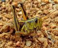
| 09/21/2005 09:13:43 AM |
I'm Gelin'by GoscheComment: Great macro. The sand almost looks like boulders here. The eye is in perfect placement of the grid of the horizontal and vertical lines in the rule of thirds. Not the most interesting shot with the color scheme, but a good effort nonetheless. Good detail and clarity on the grasshopper. |
| Photographer found comment helpful. |
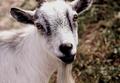
| 09/21/2005 09:11:53 AM |
Who Needs a Lawnmower?by Sherri1209Comment: Love goats. I wish his face were a tad more focused. With the placement of the eyes, they are in the intersection grid that fits the rule of thirds. Good DOF. Makes me think of that old kids' story The Three Billy Goats Gruff. :~) |
| Photographer found comment helpful. |
Home -
Challenges -
Community -
League -
Photos -
Cameras -
Lenses -
Learn -
Help -
Terms of Use -
Privacy -
Top ^
DPChallenge, and website content and design, Copyright © 2001-2026 Challenging Technologies, LLC.
All digital photo copyrights belong to the photographers and may not be used without permission.
Current Server Time: 06/21/2026 08:39:07 PM EDT.