| Image |
Comment |
| 10/05/2005 09:52:45 AM |
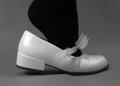
if the shoe fits...by trumpetwalrusComment: Black and white are not complementary colors. They are contrasting, but not colors at all. This would be effective (despite the "does not meet the challenge") if it were tack sharp and there were more negative space to one side of the foot/shoe. |
 Photographer found comment helpful. Photographer found comment helpful. |
| 10/05/2005 09:51:08 AM |
|
| Photographer found comment helpful. |
| 10/05/2005 09:50:17 AM |
What's Behind?by noryComment: Love the tack sharp focus. I wish there were more purple visible. |
| Photographer found comment helpful. |
| 10/05/2005 09:49:49 AM |
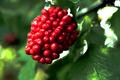
voilet and yellowby U622Comment: I love the idea of this but it needs to be tack sharp to be an effective macro. The colors are wonderful and the detail could be great and textural, but back to the focus - it's just not there. ;~( |
| Photographer found comment helpful. |
| 10/05/2005 09:48:00 AM |
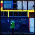
Façadeby aznymComment: I like the urban sense of this. Not the most interesting shot, but it works for me. |
| Photographer found comment helpful. |
| 10/05/2005 09:47:08 AM |
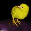
Red and Greenby swm4lfe_2001Comment: This has great potential but isn't tack sharp. ;~( I'd also do a selective color adjustment and remove some of the black from the green. I might up the yellow as well to give it more pop. Cute kid - just needs some better focus. |
| Photographer found comment helpful. |
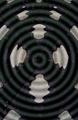
| 10/05/2005 09:44:25 AM |
Ripple Effectby TTAMComment: Black and white aren't complementary colors. They are contrasting but not colors at all. |
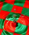
| 10/05/2005 09:43:44 AM |
Complementary drops by InnaNComment: Cool. I like the crisp focus. The undulation that the water creates on the checkerboard is ineresting and eye catching. |
| Photographer found comment helpful. |
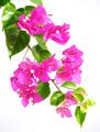
| 10/05/2005 09:43:12 AM |
Bou..gain..vill..ea!by kbhatia1967Comment: This seems a bit oversaturated to me. The colors work fine for the challange and the background showcases them well, but maybe it's the lighting. Hmmmmmm I like the diagonal sense of the branch across the "page." Maybe play with curves a bit to deepen and not just saturate? |
| Photographer found comment helpful. |
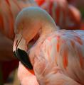
| 10/05/2005 09:41:34 AM |
Pretty in Pinkby lagansComment: I'm not seeing complementary colors. The opposite of this peachy orange would be some shade of blue and I'm not finding it in this photograph. The flamingo is a nicely posed bird, but I think since the challenge specifically called for colors that were opposite one onother, this lacks in that regard. |
| Photographer found comment helpful. |
Home -
Challenges -
Community -
League -
Photos -
Cameras -
Lenses -
Learn -
Help -
Terms of Use -
Privacy -
Top ^
DPChallenge, and website content and design, Copyright © 2001-2026 Challenging Technologies, LLC.
All digital photo copyrights belong to the photographers and may not be used without permission.
Current Server Time: 06/24/2026 02:28:03 PM EDT.