| Image |
Comment |
| 10/12/2005 09:21:35 AM |
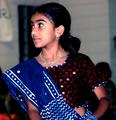
My Pride ... and Joyby mariomelComment: Nice close up. Great eyes. I'm trying to figure out what the elyptical reflection is. The dry lips are a tad distracting. Some chap stick perhaps? Lovely child. Beautiful lighting and skin tones. |
 Photographer found comment helpful. Photographer found comment helpful. |
| 10/12/2005 09:20:25 AM |
The proudest uncle in the world!by moonjeongComment: Nice natural pose. I wish the baby was looking at the camera too, but the title is all about the uncle and he's captured quite well. The crop seems just a bit tight. Good DOF. |
| Photographer found comment helpful. |
| 10/12/2005 09:19:39 AM |
|
| 10/12/2005 09:18:54 AM |
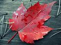
Canadian Prideby acrotideComment: Very pretty. I wish there were more space around the red leaf - the crop is a tad tight. I like the detail and focus. |
| Photographer found comment helpful. |
| 10/12/2005 09:17:50 AM |
Motherlyby LokiComment: Very nice. I love the lighting and the baby's hands. This is natural and totally unposed. Well done. |
| Photographer found comment helpful. |
| 10/12/2005 09:17:22 AM |
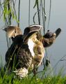
Quack!by A ShrubberyComment: HEE HEE I like the DOF. I might've left more space to the right - the crop seems a tad tight. |
| Photographer found comment helpful. |
| 10/12/2005 09:16:26 AM |
He´s proud................is she?by totiComment: HEE HEE I like this portrait. You did a good job - it's fun and different. The skin tones seem maybe a touch yellow? I can't put my finger on it. Otherwise, well done. 8 |
| 10/12/2005 09:15:35 AM |
|
| Photographer found comment helpful. |
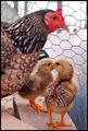
| 10/12/2005 09:14:40 AM |
MUMby banditComment: HEE HEE Nothing like a proud chicken. I love it. Nice and different. Good clarity and detail. |
| Photographer found comment helpful. |
| 10/12/2005 09:13:48 AM |
Pride in Servingby toddheadComment: I love the light. I think I'd crop just below the elbow. But the use of negative space is interesting. Good clarity of the eyes. I like this. |
| Photographer found comment helpful. |
Home -
Challenges -
Community -
League -
Photos -
Cameras -
Lenses -
Learn -
Help -
Terms of Use -
Privacy -
Top ^
DPChallenge, and website content and design, Copyright © 2001-2026 Challenging Technologies, LLC.
All digital photo copyrights belong to the photographers and may not be used without permission.
Current Server Time: 06/25/2026 08:54:00 PM EDT.