| Image |
Comment |
| 12/31/2005 05:59:45 PM |
Dirtkahunaby lynnesiteComment: I'd crop out the metal structure to the left and just have the guy and the mountains. I like the silhouette and the golden tones. Maybe reduce the dark foreground a bit more too and zoom in on the rider more. |
 Photographer found comment helpful. Photographer found comment helpful. |
| 12/31/2005 05:58:57 PM |
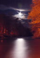
Moonriverby p2jvrComment: I like the idea of this. I wish the trees weren't so orange. The sky is incriedible and the shimmer from the back to the front of the image is very pleasing. You could almost crop out about 2 inches off of the bottom and the orangy trees on the right, and then zoom in, and it would really have impact for me. |
| Photographer found comment helpful. |
| 12/31/2005 05:57:09 PM |
grigrigirlby notesinstonesComment: I usually love out of the box artsy shots, but this just isn't doing it for me. I like the use of negative space and the tattoo on the arm is cool, but maybe there just isn't enough to peak my interest (sigh). And so it goes........................... |
| Photographer found comment helpful. |
| 12/31/2005 05:56:10 PM |
dogAngelby kiwinickComment: Sweet face. It seems just a tad off to me. Not really blurred, but almost has a slight haze to it (and I haven't even been drinking). I'd like to see this adorable pooch with the maximum 640 pixelation too. |
| Photographer found comment helpful. |
| 12/31/2005 05:55:12 PM |
glad2beadadby meowComment: The sentiment is very sweet and I like the idea of it, but with the plaid shirt and the baby's shirt with the "My First Christmas" on it, it just looks like a quick snapshot and not one that's very well thought out. I would love it if there were a solid black background and the dad and son either had on maybe black shirts, so that they faded into the backdrop OR no shirts at all, and there was one source of light showcasing facial and shoulder structure. |
| Photographer found comment helpful. |
| 12/31/2005 05:52:26 PM |
Stupidcatby o2bskatingComment: That crazy kitty!!! I have to laugh every time I see this and I've viewed it several times. I like the tangle of the lights and the almost "HUH" expression on the cat. I wish there were a touch more light on the kitty's face. Still, kinda cute and entertaining. |
| Photographer found comment helpful. |
| 12/31/2005 05:50:50 PM |
notesinstones (notes in stones)by saintaugustComment: HEE HEE. This does suit the name, but for some reason kind of leaves me with a "homemade" feeling. Maybe if the trebel clef were printed and not hand drawn. I do like the perspective and the originality of the idea. |
| Photographer found comment helpful. |
| 12/31/2005 05:49:41 PM |
Pathfinderby CamComment: I like the leading line and the scene is pretty. A bit ho hum for me though. Maybe too centered for my taste. Plus the literal translation for me would be "bridge finder" as path denotes dirt/grass on the ground, but that's just a nitpick comment. Maybe crop out one side a bit, so the bridge isn't bullseye centered. Even black and white with high contrast might be a fun approach to this shot as well. |
| Photographer found comment helpful. |
| 12/31/2005 05:47:53 PM |
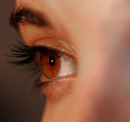
"MacroThing"by CutterComment: I think what bugs me most is the blurred bridge of the nose that takes up 1/3 of the shot. I'd much rather have the entire shot as the macro. That brown eye is beautiful and it's so clear, but I can't get past the blur of the nose. Maybe shoot from a different perspective. This certainly has merit if the ol' schnoz weren't there. 6 |
| Photographer found comment helpful. |
| 12/31/2005 05:45:22 PM |
Stare At The Sunby space amoebaComment: I think this just isn't visual enough. Yes it meets the challenge, but there just isn't quite enough eye candy for me, to make it one of those WOW shots. It has potential and I do like dark photos, but for once, this one's too dark for my taste. NOt horrible, just with it had a bit more. 6 |
| Photographer found comment helpful. |
Home -
Challenges -
Community -
League -
Photos -
Cameras -
Lenses -
Learn -
Help -
Terms of Use -
Privacy -
Top ^
DPChallenge, and website content and design, Copyright © 2001-2026 Challenging Technologies, LLC.
All digital photo copyrights belong to the photographers and may not be used without permission.
Current Server Time: 08/08/2026 07:17:27 AM EDT.