| Image |
Comment |
| 11/27/2007 12:26:42 PM |
Early Christmas Cactusby GreetmirComment: Hi Gree,
Interesting image, What I think happened here was the right side of the image accounted for your 2,3,4 scores and the left side got you the higher 5,6,7 scores. What caused this i believe are two things, First your bokeh took control over the entire image & secondly the bokeh had the effect of creating two separate images. The right side of the image seems slightly out of focus and a bit blown-out causing a lose of detail in the flower and water dropletts. On the left side however you have a nice clean, sharp image nice detail in the pedals & water dropletts. The leaf just in front of the flower is nice and soft and it\'s placement compliments the image. I would have either cropped or repositioned and used just the upper left side of the image only. This would have given you a nice line coming down the right side of the image and making that second leaf your bokeh. I took the liberty of trying it and turned out to be a really nice image that I would have scored a 7 or maybe 8. |
 Photographer found comment helpful. Photographer found comment helpful. |
| 11/26/2007 11:17:12 AM |
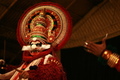
Kathakali dancerby z00bComment: Hi Z,
I like the colors here & the placement of your main subject. After that it just seems to go all down hill. The hand you used for the bokeh just seems way out of place and is more of a distraction then anything else. I would have eleminated the whole right side of the image and tried to use his hand & forearm as the bokeh. The overall image itself seems to be out of focus (got the feeling u are hand held here). I think moving left and closer may have been of some help. Your choice of setting here I don\'t understand either 1.8 500 125 ?. Overall a nice effort that just fell short. |
| 11/26/2007 10:43:22 AM |
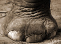
Step Upby izadoodleComment: Hi Iz,
Nice image. I like the compostion & the use of the full frame. The texture is outstanding & the details are fantastic. The tonality thro-out is also very well done. I think a we bit of sharpening possibly could have been used here. The wood chip on the foot is a bit of a distraction just keeps getting my eye & what sees to be some kind of artifact there left side up by the ankle also caught my eye, both area bit picky yes, but with such fine photography the finer details are extremely important....Love the image....Great work. |
| Photographer found comment helpful. |
| 11/24/2007 11:07:39 AM |
Refreshingby gwe21Comment: Hi,
Neat image, I like the way you cropped here brings full attention to the water nicely done. Love the detail you captured here crisp & sharp. I also like the way you famed it all in here top to bottom, left to right. Your duotones here are a nice soft blend, I like it. The only thing here that is really bothersome is that light. It is a major distraction, moving it left or right showing just the finges of it would have helped greatly. Overall like I said this is a really neat image nice work. |
| Photographer found comment helpful. |
| 11/24/2007 10:52:34 AM |
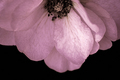
Pink Rose on Black...by 777STANComment: Hello,
Tho I like the crop the image overall is to centeralized for me.Sometimes it works sometimes not here it did not. Moveing it to the left hand corner & down a bit would have been better here. The blowout on the front & right pedal is a bit distracting, the use of a polerizer would have been a huge help to you here cutting down the glear or eleminating it completely.The color of the rose (pink) seems very flat no pop to it at all. Not sure if it is the blur tool or what but some sections of the image have real nice detail while others do not. From an overall prospective it appears to me that way to much editing was done here on a subject that really does'nt need it. I do realize that this was an advanced editing challange but we must not forget the photography here. I think you just tried to do to much with to little here. |
| Photographer found comment helpful. |
| 11/12/2007 12:22:20 PM |
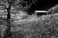
Old Workshopby KaeComment: Hi Kae,
Wonderful image ! I love the lighting here think it makes the image. The composition is very well done, & the framing is excellent. The tonality is also well done. What can I say, I love the image I think it was under rated by many I would have given this an 8 had I scored it. Nice work !!!! |
| Photographer found comment helpful. |
| 11/12/2007 11:53:26 AM |
The old cottageby BrinComment: Hi Brin,
Very nice image, peaceful & calming. I really like your composition all the elements come together extremely well. I also like the way you framed it all in, the placement of the tree & brush line in the foreground are well done & the cottage is very well placed. I also like the use of the slope here gives us a three dimensional feel for the image. I like the tonality here it all works really well. If there is one thing that hit me & I am not sure there is much you could have done about it is the tree trunk, it was the very first thing that caught my eye. The blackness of the trunk in relation to the rest of the tree & overall image is a bit of a distraction it just kept drawing my eye. Overall this is a wonderful image like I said very peaceful & calm. |
| Photographer found comment helpful. |
| 06/22/2007 04:05:42 PM |
So much comfort in a smile!by djtiekComment: Hi Dan,
Cute image:
Composition - I like your use of the dead space here works well, also like the placement of your subjects.
Framing - well done plenty of room for swings forward motion. Also like the way they both stand out against the backround.
Focus - Does seem a bit soft to me.
Exposure - colors are nice and strong, I do see a slight hot spot right behind babies head on her back (green shirt).
The distraction I see here is that blue rope or something on the ground to her left. |
| 06/22/2007 03:50:11 PM |
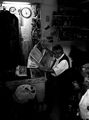
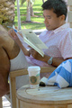
Lazy Saturdayby _eugComment: Hello Eugene,
Hmmm, not sure what to make of this.
Composition - Way to tight up & down, left to right cropping here leaves alot to be desired.
Framing - cramped, to much info in to little a space. Because of this the coffee cup, sun glasses & towel detract from the guy reading the book and the opposite can be said for the guy.
Focus - seems kinda soft all around. |
| Photographer found comment helpful. |
| 06/22/2007 03:13:28 PM |
Intensityby rileyComment: Hi Riley,
An over all nice image:
Composition - Only thing here is the cropping of the gentlemans head there in the front is a little bothersome.
Framing - Like your framing here nice and tight without being to busy.
Exposure - Think it maybe a little underexposed the tonality seems to be a bit off.
Focus - Seems a little soft, could be crisper.
Over all this is a nice image,I am having some difficulty focusing in on the intensity of the image as a whole though just don\'t know why. Could be the distance. |
| Photographer found comment helpful. |
Home -
Challenges -
Community -
League -
Photos -
Cameras -
Lenses -
Learn -
Help -
Terms of Use -
Privacy -
Top ^
DPChallenge, and website content and design, Copyright © 2001-2026 Challenging Technologies, LLC.
All digital photo copyrights belong to the photographers and may not be used without permission.
Current Server Time: 07/17/2026 03:14:38 PM EDT.