| Image |
Comment |
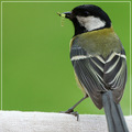
| 05/26/2006 12:16:30 PM |
caught it ! by MIN-BITERComment: Wonderful sharpness and DOF. I wish there were a little more room above his head so he wasn't so cramped against the top fo the frame. Congrats, these little guys are quick. |
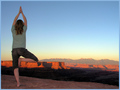
| 05/26/2006 12:13:58 PM |
Successful Serenityby deepfrog17Comment: Very nice shot. I think maybe a slightly lower angle would have been better so that her knee clears the horizon. |
 Photographer found comment helpful. Photographer found comment helpful. |
| 05/26/2006 10:12:43 AM |
One Small Step ... by tateComment: Love the backlighting! Nice job exposing in a tricky (but beautiful) lighting situation. Mom in the background is actually kind of distracting. I think it would be a stronger shot without her there or if you had stepped to the left a little so there was more separation between her and the baby. 7 from me. |
| Photographer found comment helpful. |
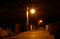
| 05/22/2006 08:21:20 PM |
Boardwalkby diegomcnamaraComment: Greetings from the critique club,
I read your self-critique. I think you were much too hard on yourself. THis is a very nice night shot.
I think you sdid a great job with the flare, especially with basic editing. I like your perspective and the way the horizon meets the end of the dock.
COmpositionally, I agree with your comments. I would have cropped right to the post on the left, so that the dock posts frame the shot. This would also make the biggest light less centered inthe frame. You could crop a little off the bottom without changing much if you want3ed to keep the horizontal aspect ratio.
Depending on the rest of the scene (that is outside of the frame here) it might have been better to take a few steps to your right and angle in a little so that the dock cuts more across the image. I like the leading lines of the dock and the vertical lines of the poles, and I think angling the dock even more than you did would make it even more dramatic.
I didn't vote in this challenge, but I would have given this a 6. I think it is well executed and interesting to look at.
Please feel free to pm me with any questions about my comments.
Cheers,
Liza |
| Photographer found comment helpful. |
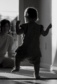
| 05/22/2006 08:07:55 PM |
Shadows of Playtimeby photoventurerComment: Greetings from the critique club,
This is a tough one for me to critique. I have spent a long time looking at it, and I am struggling to put my finger on exactly what I would suggest to improve it. Here are my thoughts ...
This is very nicely exposed for a night shot. I like the details in both the highlights and the shadows. It is nice and sharp, even with the long exposure.
I like the light coming in from the side and below. It has an eerie quality, which seems appropriate for an empty playground at night. Kind of creepy.
I like the idea of having the slide come down and meet the bottom corner, but I feel like the composition is a bit unbalanced. The empty space on the right side doesn't seem like effective use of negative space to me. The interesting parts of the image are the lines of the bars and they are all clustered on the left side but somehow I find my eye staring out into the emptiness over on the right. It is hard to explain, but it lessens the impact of the iamge for me. The best suggestion I can think of would be to somehow crop in tighter without losing the long leading line of the slide.
Cheers,
Liza |
| 05/21/2006 08:04:46 PM |
Hi thereby tazzaComment: Very cool angle and perspective. I love the distortion. I think the clock on the wall is kind of awkward and distracting. 8 from me. |
| Photographer found comment helpful. |
| 05/21/2006 07:59:29 PM |
Hide and seek.by photogeneComment: Cute idea. The lighting here is very harsh. (I am guessing you used the on camera flash?) Try putting your setup next to a window and using natural light next time. I think you will get much better results. |
| Photographer found comment helpful. |
| 05/20/2006 10:56:38 PM |
Tea for the Fishermanby tembaComment: I like his relaxed pose. His eyes are very dark in this portrait. Turning him slightly to try to get some light into his deep set eyes and some catchlights would have helped alot. |
| Photographer found comment helpful. |
| 05/20/2006 10:51:20 PM |
Springby elsapoComment: The field makes a very nice background, especially with such nice DOF. There is a strong green cast on her skin and hair. |
| Photographer found comment helpful. |
| 05/20/2006 10:49:27 PM |
Teenageby Joey LawrenceComment: Very cool shot and very well executed. The lighting on her face is fantastic. My only nitpick is that it would have been nice to have the whole circle complete and not cut off at the bottom. |
| Photographer found comment helpful. |
Home -
Challenges -
Community -
League -
Photos -
Cameras -
Lenses -
Learn -
Help -
Terms of Use -
Privacy -
Top ^
DPChallenge, and website content and design, Copyright © 2001-2026 Challenging Technologies, LLC.
All digital photo copyrights belong to the photographers and may not be used without permission.
Current Server Time: 07/17/2026 07:10:24 AM EDT.