| Image |
Comment |
| 06/01/2006 10:43:05 PM |
|
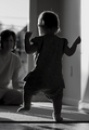
| 06/01/2006 10:31:08 PM |
One Small Step ... by tateComment: Everything about this shot works so well for me....the b/w, the dof, the lighting and catching that foot at just the right moment. Going into my favorites. |
 Photographer found comment helpful. Photographer found comment helpful. |
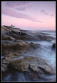
| 05/30/2006 12:14:16 PM |
|
| Photographer found comment helpful. |
| 05/24/2006 07:12:18 PM |
Deep Thoughtby jeroweComment: This is very good. I agree with Jutilda that the colors work together well. His eyes are clear and become the focus of the shot, which is what I like best about most portraits. Very nice! |
| Photographer found comment helpful. |
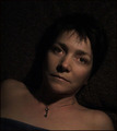
| 05/24/2006 02:59:08 PM |
The Keyby xtineComment: This has a subdued appeal to it, I think. However, since it is advanced editing, I would have softened the light glare that is on the tip of the nose, as it is distracting in the otherwise low light. |
| Photographer found comment helpful. |
| 05/24/2006 02:56:15 PM |
|
| Photographer found comment helpful. |
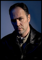
| 05/24/2006 02:54:06 PM |
Mby LouisComment: Everything works together really well in this shot - the lighting, attire, gaze and background together give an almost sinister (for lack of a better word) effect. The lighting and focus on the front eye really force the viewer to connect with the subject. Excellent! |
| Photographer found comment helpful. |
| 05/24/2006 02:51:44 PM |
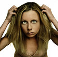
Bad hair dayby Arti-ElviComment: Maybe you were going for a particular type of look, but to me this is just an odd self-portrait. The editing makes it a bit surreal and the pose and angle give an unnatural look. With the elbows cut off, it almost gives a look of having four arms lol. The lighting, however, is good. I just don't find the overall look very appealing. |
| Photographer found comment helpful. |
| 05/24/2006 02:48:23 PM |
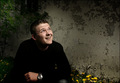
Enlightmentby TUBORGComment: This is one of my favorites so far. The slight bit of yellow at the bottom helps add just a bit of brightness. The lighting and pose are both excellent. I wish the wrist watch was taken off, however. The background wall gives good texture and depth to the shot. Well done! |
| Photographer found comment helpful. |
| 05/24/2006 02:46:32 PM |
Barn Windowby swallaceComment: I really like the looks of this one. To nitpick, the tone is a bit too saturated for my tastes, and the eyes seem just a bit softer in focus than I would like. The composition and lighting are great. |
| Photographer found comment helpful. |
Home -
Challenges -
Community -
League -
Photos -
Cameras -
Lenses -
Learn -
Help -
Terms of Use -
Privacy -
Top ^
DPChallenge, and website content and design, Copyright © 2001-2026 Challenging Technologies, LLC.
All digital photo copyrights belong to the photographers and may not be used without permission.
Current Server Time: 07/22/2026 05:54:08 PM EDT.