| Image |
Comment |
| 11/22/2011 07:46:43 PM |
Schlage, Good and Evilby karmatComment: Yes, some people have taken the challenge title "Doors, Gates, Knobs, Locks & Handles", gone away and taken a photo of one of those things, others understood brief of capturing the beautiful details in those everyday things. Some people, like the artist behind this photo, did the right thing. This is art, it tells a story, good vs evil. It's beautiful and it fulfils the challenge title and brief. What more can I say than, fantastic lighting, composition, detail, brilliant choice for depth of field. Very pleasing to the eye. |
 Photographer found comment helpful. Photographer found comment helpful. |
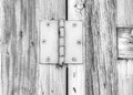
| 11/22/2011 07:40:27 PM |
on the shed doorby flahermaComment: I'd like to see high contrast in this photo, without comprising the brightness too much, |
| Photographer found comment helpful. |
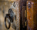
| 11/22/2011 07:35:04 PM |
old lockby LawtonComment: I like this. Everything seems well placed in the image. Good contrast, good highlights and lowlights. |
| 11/22/2011 07:32:39 PM |
Kitchen Cupboard Doorsby DistantColoursComment: WHITE WHITE WHITE. Too much white, seems to have lost some of the detail to the whiteness. On the other hand, it's clean with simple but interesting shadows. |
| Photographer found comment helpful. |
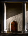
| 11/22/2011 07:30:57 PM |
En-Tranceby CuttoothComment: The lighting in this photo gives it an almost magical mystical feel. I like the sparsity of colour and the roughness of the wall. |
| Photographer found comment helpful. |
| 11/22/2011 07:28:52 PM |
Doors, Knob, Lock and Handlesby banmornComment: This is pretty, many shapes, many layers of detail, I like the fact that you can see that the door handle has been moved or replaced. Different light conditions could have improved this photo. |
| Photographer found comment helpful. |
| 11/22/2011 07:22:53 PM |
|
| 11/22/2011 07:20:35 PM |
Press Button to Open - It's Not Lockedby Dr.ConfuserComment: Not the sort of ordinary details that most people see everyday, but I like it. With the exception of the motif, the details are ordinary. Some panels look a little beat up which gives the picture an honesty. I like. |
| Photographer found comment helpful. |
| 11/22/2011 07:16:35 PM |
Its not Adoor its Ajarby WebbToggComment: Firstly, I think the title is terrible. Secondly, the depth of field is too shallow, I like shallow, but for this subject I wanted to see more of the nuts and bolts. Thirdly, I like the subject, the little carved crosses (x's) are cute, the half hidden lock gives the viewer something missing that add intrigue!! |
| Photographer found comment helpful. |
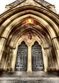
| 11/22/2011 06:41:58 PM |
Under the Archesby KarenNfldComment: I like the composition of this image. Lovely symmetry. Plenty of tonal variation and interesting details. I don't like the white sky (I get them in my photos all the time and it really annoys me) |
| Photographer found comment helpful. |
Home -
Challenges -
Community -
League -
Photos -
Cameras -
Lenses -
Learn -
Help -
Terms of Use -
Privacy -
Top ^
DPChallenge, and website content and design, Copyright © 2001-2026 Challenging Technologies, LLC.
All digital photo copyrights belong to the photographers and may not be used without permission.
Current Server Time: 07/15/2026 11:19:21 PM EDT.