|
|
|
Showing 271 - 280 of ~498 |
| Image |
Comment |
| 05/15/2004 11:46:38 PM | Yellow Daisyby TrollManComment: I really like this shot a lot. The colors and focus are simply stunning. I think maybe a little more black on the ride side will help the balance a little bit. For some reason, the overexposure really hits well with me. I think it is because it gives more range in the color yellow, going from dark to light (nearly white). It adds nice contrast. Very nicely done!
;D |  Photographer found comment helpful. Photographer found comment helpful. |
| 05/15/2004 11:42:49 PM | | | Photographer found comment helpful. |
| 05/15/2004 11:09:09 PM | P5100124_small.jpgby drgsoellComment: Actually, I like this shot a lot. The focus is stellar and the subject very definite. I would play with the levels a little bit to darken up the green background in the shot, because the the green really pops out a little more than it should, but this is just a minor technicality. Also, the lighting is just a tad flat, but I think that could be adjusted with levels and contrast, but again, minor technicality. Also, I think I would also crop just a little bit off the top to help the balance a bit. For a 9-year-old, this is an excellent start (much better than my first). I actuallyu think it would have faired quite well in the rusted challenge. Tell her good job and good luck for the future! |
| 05/15/2004 11:03:39 PM | Central.jpgby TranquilComment: Very neat shot! I feel though that the sky is quite blaringly bright. I take it this shot was taken with an overcast sky. Shots that include the sky like this are kind of hard to get right. I realize you probably couldn't have waited around to have a dynamic sky (or even blue for that matter), it most likely something you didn't have control over. Gray skies tend to be rather dull, even though the subject is stellar, the sky can retract a bit from the original quality intent. I'm not saying this is a bad shot by any stretch of the imagination, I am simply pointing out what I think would improve this shot. The sky here really draws attention away from the subject and is best described as...well...blaring. Yoiur composition though is simply marvelous. Beautifully angled. Again, a nice shot with excellent angle and compostion, its just that the sky distract the eye from the subject. I hope you found this comment helpful.
~Matthew Dykman (goinskiing)
;D | | Photographer found comment helpful. |
| 05/15/2004 10:49:59 PM | Curiosityby JackoComment: Did the cat get killed (curiosity killed the cat)? Also, is this the same cat as your brown ribbon? | | Photographer found comment helpful. |
| 05/15/2004 10:20:35 PM | Little Bear Riverby dsidwellComment: ABSOULUTELY stunning! This is some of your premiere work. Definitely something to be proud of. You have a marvelous eye for shots like this. The composition is absolutely stellar. Very nicely done! | | Photographer found comment helpful. |
| 05/13/2004 12:31:21 AM | Flightby faidoiComment: Very neat there faidoi. Excellent clarity and the turqoise duotone works EXTREMELY well, nicely done! | | Photographer found comment helpful. |
| 05/10/2004 12:14:55 AM | Father & Childby RoosterComment: Very Cool shot you got here Roost! Very well captured and the title fits it very nicely. Congrats on a good score as well! Good work! | | Photographer found comment helpful. |
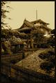
| 05/09/2004 08:22:12 PM | Inakani Oteraga Arimasuby JesuispeureComment: *Greetings From the Critique Club!* :D
Fantastic image you got here, something to be proud of.
Composition:
I believe this is by far your strongest element of the photo. The way you have it set up, with the angle and all, makes it look like you carefully considered what elements were needed in the shot and where they should be placed, you have done a nice job here. It is well framed by the plants surrounding the shot and really enhances. Using framing techniques like this can really enhance a shot, especiallly the outdoor shots. Excellent focus as well.
Lighting and Color:
According to the commenters/slash voters, it appears that this is the most controversial part of this shot. Sepia, desaturation, and color is one of those arbitrary things when it comes to voting, mostly due to the fact that it is highly subjective to personal taste. However, I can tell you my personal preference as far as this shot goes. I honestly would havbe liked to see this shot in color. I believe the color can tell so much about a place, especially in the "Where You Live Challenge." When I think about this challenge, the word culture pops into my mind, and when I think of culture, I think of diversity and variety, and I think color has a lot to do with that in the shot. The sepia does work, don't be discopurage dabout that, you did a nice job with that. I am just telling you my PERSONAL preference and trying to give an objective opinion.
Other Thoughts:
A very nicely composed shot that has some very pleasing elements and enjoyable to look at. Good luck in future challenges and hope to see some more of your work doing well.
If you have any comments, questions, or concerns, feel free to PM at anytime. I am more than willing to answer an questions you may have.
~Matthew Dykman (goinskiing) |
| 05/06/2004 07:42:13 PM | La Purisma Golf Course, Lompoc CAby neilmwilsonComment: *From the Critique Club*
:D
Very cool image!
Composition:
Really, I can't find any real composition issue, the only thing that really cought my attention as far as this goes was the foreground, for some reason, my eye keeps getting drawn into the foreground of the shot, distracting me from the beauty of the shot.
Focus:
Overall good focus. I am not usre or not if NeatImage was used, but I personally don't think it ruined it if you did. It does kind of have a usrreal feal to it, but I think that just adds to the quality of the shot.
Color and Lighting:
This is what makes this shot and excellent photo instead of a good photo. The lighting is so dynamic. You picked the PERFECT time of day to shoot this. This kind of lighting does quite a few things:
1. Creates different shades and tones of colors, giving you a wide variety from dark all the way through light. Gives the shot a feeling of completeness.
2. Adds shadows that help bring out the contrast and brings out the contours of the land, giving it more depth.
3. Gives you a nice exposure. Nothing is too dark and nothing is blown out.
I would say you hit the nail on thead with the lighting here and that's why you were rewarded with you're good score.
Other:
A very captivating shot. Makes you feel like you are really there at tee-time. Very dyanamic and very pleasing to look at.
If you have any comments, questions, or concerns, please feel free to PM me.
Best of luck to ya in future challenges!
~Matthew Dykman (goinskiing) |
|
Showing 271 - 280 of ~498 |
Home -
Challenges -
Community -
League -
Photos -
Cameras -
Lenses -
Learn -
Help -
Terms of Use -
Privacy -
Top ^
DPChallenge, and website content and design, Copyright © 2001-2026 Challenging Technologies, LLC.
All digital photo copyrights belong to the photographers and may not be used without permission.
Current Server Time: 07/17/2026 02:47:10 PM EDT.
|