| Image |
Comment |
| 05/14/2004 10:28:16 PM |
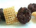
Intermingleby elsapoComment: I'm not sure about opposites, but the pic rocks. I'd really like to know your technique on this. |
 Photographer found comment helpful. Photographer found comment helpful. |
| 05/14/2004 10:26:40 PM |
circles and squaresby binkyat3Comment: Very original take on the challenge. Nicely shot too. Not overexposed for the most part. Good macro too. 10 |
| Photographer found comment helpful. |
| 05/14/2004 10:25:12 PM |
Positive and Negativeby Beerme425Comment: The first original shot I've seen in this challenge. Good take on the challenge. Well shot, I know it's hard to capture an arc like that. 10 |
| Photographer found comment helpful. |
| 05/14/2004 10:23:49 PM |
Balloonby MattOzComment: What I think I see is a mylar balloon with a string. The balloon is overexposed to the extent that it's not easily identifiable, also needs more depth of background to set the balloon off. |
| 05/14/2004 10:18:55 PM |
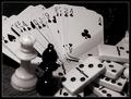
Black & White Gamesby HotchieComment: Good concept, but the pic is almost too busy. Simplfy. Perhaps just the cards or chess pieces by themselves on a stark background. 7 |
| Photographer found comment helpful. |
| 05/14/2004 10:16:48 PM |
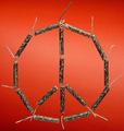
Peaceful Explosionby peeteComment: One of those people that hoard fireworks for later in the year (just in case). :) Interesting shot and concept, I think one lit fuse might have enhanced the meaning. 7 |
| Photographer found comment helpful. |
| 05/14/2004 10:14:51 PM |
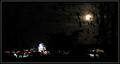
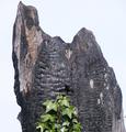
The Lights at Nightby LenMComment: It took me a while to understand what your shot is, a tree with moonlight thru it's branches and a cityscape in the background. Maybe lighten up the background just a bit to make it a little easier to understand. |
| Photographer found comment helpful. |
| 05/14/2004 10:12:41 PM |
|
| Photographer found comment helpful. |
| 05/12/2004 11:48:00 PM |
Two Fatesby wkoffelComment: Poor exposure on the right side of pic. You almost can't see that person without looking carefully. Switch to no flash and a longer exposure with the camera on a support. |
| Photographer found comment helpful. |
| 05/12/2004 11:13:44 PM |
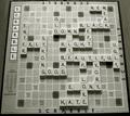
Game of Opposites!by wilksComment: I'll give you an E for effort. Interesting take on the challenge, certainly unique. Photgraphically, I think it would look better in color and from directly above the board. The perspective in this view makes the top of the board look smaller |
| Photographer found comment helpful. |
Home -
Challenges -
Community -
League -
Photos -
Cameras -
Lenses -
Learn -
Help -
Terms of Use -
Privacy -
Top ^
DPChallenge, and website content and design, Copyright © 2001-2026 Challenging Technologies, LLC.
All digital photo copyrights belong to the photographers and may not be used without permission.
Current Server Time: 07/18/2026 06:47:50 AM EDT.