| Image |
Comment |
| 04/25/2004 04:29:22 PM |
Watching the world go byby pcrymbleComment: Greetings from the Critique Club!
I love this shot, I have no idea if it was staged or not but it's a beautiful, thoughtful shot and the sepia works very well with this, though a touch, just a small touch more contrast would make it work a little better to me. I like the wide vertical line on the right but the thinner one on the left is a bit distracting to me. The composition, the cropping is close to perfect. A slightly higher crop on the top, so the top of her head isn't cut off would make this perfect for me. It's so close now that I would like to see the rest of the hair.
Black and white, with a higher contrast would also make this a great shot. Not much else to say except looking at your final score, you were robbed!
Good Luck In Future Challenges!
Deannda
DNeufer@stny.rr.com if you have any questions or want to discuss this further! |
 Photographer found comment helpful. Photographer found comment helpful. |
| 04/25/2004 03:26:48 PM |
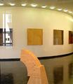
Art Gallery at Long Island Universityby LesyaComment: Greetings from the Critique Club!
Overall this is a great shot, the clarity, the curver of the ceiling and floor, they lead you around the shot, the piece in the center to bring you back in. The reflection on the left, to me, is the only way I would be able to tell that this was taken through a window and to me, takes more away from the shot than helps it. If there was a frame on the left or right that could have defined the shot for me, I think I would have liked it much better.
As for the shot overall, there is not a lot of interest to really hold me here for long. THe lines are great and composition is very well done but the subject matter is a bit on the dull side. Not sure if cropping would help or not.
Good Luck In Future Challenges!
Deannda
DNeufer@stny.rr.com if you have any questions or want to discuss this further! |
| Photographer found comment helpful. |
| 04/21/2004 12:03:13 AM |
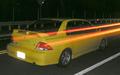
Ghost Wheelsby laybackComment: Greetings from the Critique Club!
Very interesting shot for the challenge. I like the idea but the shot itself leaves much to be desired for me. First the graininess of the shot overall is very distracting to me and really hurts the overall effect. I know you are going for a ghost effect and you did acheive that to a point but what it really looks like to me is a double exposure shot, one with the car sitting still and another with the car driving through the shot, hence the orange/red streak for the tail lights. I think if the shot didn't have the streak through the middle of it, it would have a much better impact overall.
The shot is also a bit too dark in some spots and overly bright in others (like the back of the car, the plates are glaring at me, distracting me again) The road looks more ghostly than the car does.
It's a good idea and with some adjustments to the light and working on getting the streaks out it has a lot of potential to be a really cool shot, a bit more light and contrast to really make the color of the car pop.
Good Luck In Future Challenges!
Deannda
DNeufer@stny.rr.com if you have any questions or want to discuss this further! |
| Photographer found comment helpful. |
| 04/20/2004 09:41:57 AM |
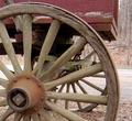
retiredby cjocelynComment: Greetings from the Critique Club!
What a wonderful shot! I didn't get a chance to vote in this challenge but if I had this would have gotten an 8 from me, at least. The image does convey a great sense of retired and the wear and weathered look on the wagon and the wheel is very nicely detailed. I played with the cropping a little bit (putting paper on the screen to try different looks) and a slightly tighter crop on the right really brought the wheel out more and maybe a slightly bigger crop on the left so the one spoke on the upper left is complete? The lighting is very nice, natural but not overly bright, again lending to the feeling of relaxed and retired. A touch more contrast might help just a bit but other than that this is a great pictures!
Good Luck In Future Challenges!
Deannda
DNeufer@stny.rr.com if you have any questions or want to discuss this further! |
| Photographer found comment helpful. |
| 04/17/2004 09:26:35 PM |
|
| Photographer found comment helpful. |
| 04/15/2004 06:58:37 PM |
One of these goes to my house!!!by TommyMoe21Comment: Greetings from the Critique Club!
What a mess of wires! Are you sure one leads to your house? LOL!
A decent shot overall but it lacks pop. Nothing really jumps out at me and says, "HEY! LOOK AT ME!" A bit more brightness or contrast could really make this shot stand out a bit more. Also, if you could crop it more so there are wires throughout the shot, the upper left corner is free and clear and takes away from the chaos theme you are going for. Maybe a slight rotation to straighten up the poles and more the wires around a bit more?
Hope this helps, if you have any questions, please feel free to email me!
Good Luck In Future Challenges!
Deannda
DNeufer@stny.rr.com if you have any questions or want to discuss this further! |
| Photographer found comment helpful. |
| 03/25/2004 09:59:29 PM |
Kidnapped Radianceby frumoazniculComment: Greetings from the Critique Club!
This is a very interesting shot, a different take on the usual studio type look and that can work both to your advantage and against it. I personally liked this shot for the composition and the expression and cropping. The post processing left me just a little off though. I think it's the coloration around her eyes, almost gives her a zombie look, if that was a little softer I think this shot would really stand out. Also the cropping on the right seems just a tad tight, a bit too close to the back of the ear, maybe just a touch more hair to be seen?
I would love to see this shot before the processing to see if the coloration around her eyes is from makeup perhaps? Other than that, a wonderful shot.
I see you are in Romania, my Sister-In-Law is from there, not sure exactly where but I know she and my brother plan on traveling over there this summer.
Good Luck In Future Challenges!
Deannda
DNeufer@stny.rr.com if you have any questions or want to discuss this further! |
| Photographer found comment helpful. |
| 03/17/2004 12:32:31 PM |
Futuristic Highwayby xcharrierComment: St. Louis Arch or something similar I'm guessing? Very creative, love the flow, looks great but could just a bit more contrast for my taste. An 8 |
| Photographer found comment helpful. |
| 03/15/2004 12:22:11 AM |
Samby JackoComment: Jacko? He's growing so fast! And such a wonderful model for his daddy! This is classic, well done and just beautiful. How can I give it anything less than a 10? |
| Photographer found comment helpful. |
| 03/15/2004 12:20:31 AM |
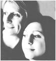
Mother and Daughter (Reluctant models)by geewhyComment: Oh, this is a great shot but the post processing really hurts it to me ;( The blow out on the left sides of their faces, the noise in the shot, makes it unique but I would score so much higher if a cleaner, better contrasted shot. As is a 6 |
| Photographer found comment helpful. |
Home -
Challenges -
Community -
League -
Photos -
Cameras -
Lenses -
Learn -
Help -
Terms of Use -
Privacy -
Top ^
DPChallenge, and website content and design, Copyright © 2001-2026 Challenging Technologies, LLC.
All digital photo copyrights belong to the photographers and may not be used without permission.
Current Server Time: 06/18/2026 09:53:53 AM EDT.