| Image |
Comment |
| 12/14/2003 11:33:26 AM |
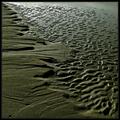
Shape of Leaves to Comeby kayceeComment: I like the layout here and your very nice design. I wonder how this might have looked without the overexposure in the center background? I think a natural looking background would have been better.
|
 Photographer found comment helpful. Photographer found comment helpful. |
| 12/14/2003 11:31:40 AM |
|
| Photographer found comment helpful. |
| 12/14/2003 11:31:11 AM |
Hanging Aroundby SonifoComment: Wonderful image. A 10 from me, and one of my top choices. Slight overexposure on the white area background top, but not significant. |
| Photographer found comment helpful. |
| 12/14/2003 11:30:08 AM |
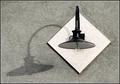
monster shadowby ursulaComment: Nice effect. I think it would have been good to shoot from a higher perspective than here, so you have a bit more of the real fork. I showed this to someone and I had to point out that the shadow was actually a shadow. If the real fork wasn't shot from the edge only, there would also be a complementary symmetry. |
| Photographer found comment helpful. |
| 12/14/2003 11:28:04 AM |
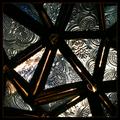
Abstract Starby mariomelComment: An interesting idea and good pattern study. I find the lighting you chose works against this though. The overexposed areas are distracting, and yet many of the other areas of the glass are too dark. Actually, if I hold a sheet of paper over the left 1/3 or more where most of the overexposed area is, it looks like that might have been a good crop. |
| Photographer found comment helpful. |
| 12/14/2003 11:25:43 AM |
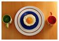
Eggs Elevenby jonpinkComment: A nice geometric study of shape. Not sure about the inclusion of the egg with the burnt edges though. Maybe soft boiled would have been better here. Also, the directional light is good, but a bit strong and overexposed in the upper right. But overall, I think it has good aesthetics, and you have an artistic eye. |
| 12/14/2003 11:23:12 AM |
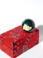
Ball and Boxby jeeperComment: A good subject and good lighting/exposure/details. I think the composition here is distracting though. Why the vertical crop, especially with the left corner and the shadow cropped, yet so much space at the top? Following the rule of thirds is fine, but I don't think the crop works here. |
| 12/14/2003 11:21:01 AM |
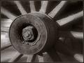
1859 Sunriseby sherComment: Nice shot. It could use a bit more DOF IMHO. Also, I think it would work better as a geometric/abstract shot (shape) if the background elements weren't there on the left, as well as the detail in the floor. |
| Photographer found comment helpful. |
| 12/14/2003 10:00:21 AM |
A simple complexby jonpinkComment: A good capture of the moon, simple shot too. I find the composition/crop here not very dynamic. Too close to the edge perhaps or too much dead space. I think you might keep it in the left or top third, and crop a bit tighter. |
| 12/14/2003 09:58:13 AM |
As Simple As ...by GeneralEComment: Simple on two planes. A good arrangement too. I think you should have tried to postprocess with neatimage or other two get rid of the "aging" on the surface of the letters. That plus the slight reflections make them look less apealing and detract from the shot. |
| Photographer found comment helpful. |
Home -
Challenges -
Community -
League -
Photos -
Cameras -
Lenses -
Learn -
Help -
Terms of Use -
Privacy -
Top ^
DPChallenge, and website content and design, Copyright © 2001-2026 Challenging Technologies, LLC.
All digital photo copyrights belong to the photographers and may not be used without permission.
Current Server Time: 07/23/2026 05:28:54 PM EDT.