| Image |
Comment |
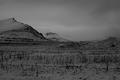
| 11/22/2004 11:48:26 PM |
Winterby kremkexComment: Nice scene! Photo seems muddy--without true whites. IMHO, it needs to be leveled. |
 Photographer found comment helpful. Photographer found comment helpful. |
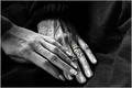
| 11/22/2004 09:36:27 PM |
Mother and Daughterby admart01Comment: Very nice--I would like it better if it were all in B&W. The ring distracts. Also, maybe the negative space doesn't work well here because the background is so "light" (if it were pitch black area, then yes...) |
| Photographer found comment helpful. |
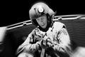
| 11/22/2004 08:07:16 PM |
Ask Notby strangeghostComment: Wow--I couldn't tell it was a mannequin! Great shot, I thought you would ribbon! |
| Photographer found comment helpful. |
| 11/22/2004 12:04:31 AM |
|
| Photographer found comment helpful. |
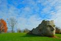
| 11/21/2004 11:47:55 PM |
Chief Leatherlipsby xtabintunComment: Great colors here (even if a bit oversaturated). Although real, the composition and colors make this surreal. Not sure about the connection to Heroes, but the shot is great. |
| Photographer found comment helpful. |
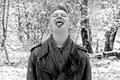
| 11/21/2004 11:43:02 PM |
Sonby adineComment: Title could mean your son is your hero,and I like the symmetry here. However, a simple, get some snow on your tongue photo doesn't really tell a hero's story. |
| Photographer found comment helpful. |
| 11/21/2004 11:41:21 PM |
Vigilanceby FotowereldComment: Sorry, I don't understand the connection to hero or the hat. Nice sharp photo though with good tones. |
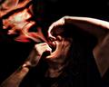
| 11/21/2004 12:42:50 AM |
(s)AINTby Joey LawrenceComment: Very interesting! Good idea, generally works well, but here's what I think might improve it:
1) more space around the left upper corner. The flames/spirit ends there, it appears, right at the edge, which means you are cropped to tight (or not tightly enough
2) the strong top lighting isn't necessary--I am not sure if it detracts. Directional lighting is a good idea, but I think lighting from below or the side would be better (just my opinion, of course.)
3) Maybe as a result of the lighting, but the skin tones are posterized/quantized. That too may be good, but it gives it a lower quality look--or maybe it's the photos "edge", but to me it detracts rather than helps.
Great shot as is--hope this helps in any further editing or if you decide to reshoot. |
| Photographer found comment helpful. |
| 11/20/2004 06:26:53 PM |
|
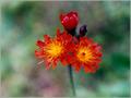
| 11/20/2004 08:46:12 AM |
Orange Hawkweed (Hieracium aurantiacum)by undieyatchComment: Background is very nice, but IMHO the photo does not offer an impressionistic/artistic view of the flowers themselves. Perhaps if you did what Yura suggests and make them out of focus, taking advantage of your lenses "impressionistic bokeh". Message edited by author 2004-11-20 08:46:27. |
Home -
Challenges -
Community -
League -
Photos -
Cameras -
Lenses -
Learn -
Help -
Terms of Use -
Privacy -
Top ^
DPChallenge, and website content and design, Copyright © 2001-2026 Challenging Technologies, LLC.
All digital photo copyrights belong to the photographers and may not be used without permission.
Current Server Time: 07/26/2026 09:53:11 PM EDT.