| Image |
Comment |
| 12/03/2004 11:26:46 AM |
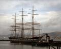
Sailing into Historyby mirdonamyComment: Nice idea. While I sort of like the soft pastel look here, it seems to me this is "underprocessed"; it might be improved by using USM to sharpen it a bit, upping the saturation slightly, applying levels or boosting contrast a bit, and possibly cropping to get the boat out of horizontal center. Where to crop is a little issue: it wold be nice to have only this boat in the shot, but to get rid of the tug would require cropping too tightly on the tall ship. Still, this is advanced editing, and a crop with a little "removal" might have been a good idea. Or more simply, you could try cropping on the left. After the challenge, if you want, I'd be happy to help you play with this a bit. |
 Photographer found comment helpful. Photographer found comment helpful. |
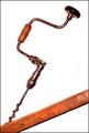
| 12/02/2004 11:13:32 PM |
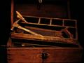
The Tools of My Fatherby fotodudeComment: Great subject matter choice, and very nice shot. One idea for possible improvement would be to not crop so tight at the top, and to make the drill more visible. But very nice overall. |
| Photographer found comment helpful. |
| 12/02/2004 11:01:10 PM |
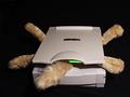
Cat Scan by BradComment: Very cute concept/title and good capture. Would be better of course with a real cat, but logistically difficult to arrange! |
| Photographer found comment helpful. |
| 12/02/2004 12:37:00 AM |
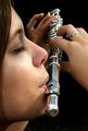
Breath of a Noteby DefyTimeComment: This was a good idea, and I like the composition and angle you chose. I like the lighting and how it emphasizes and softens her features. At first it looks like her skin was neat image treated, and too much, but looking closely, I think it's just right (and probably not neat image).. |
| Photographer found comment helpful. |
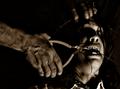
| 12/02/2004 12:33:26 AM |
Ye Olde Braces Upgradeby Joey LawrenceComment: I suspect this will be a ribbon winner for it's great dramatic lighting and good sense of humor. Good acting. At least I hope he is acting! LOL |
| Photographer found comment helpful. |
| 12/02/2004 12:30:23 AM |
Muscle Powered Drillby Moose101Comment: I love the angles here and the use of the white background. Beautiful capture, and certainly low tech! One of my top picks for the challenge. |
| Photographer found comment helpful. |
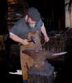
| 12/02/2004 12:29:17 AM |
Hammer and Anvilby drydocComment: Beautiful capture, and certainly low tech! A strong contender here. One thing I think can be improved here is the composition; I think it would be good to crop a bit from the left, and putting his head around the sweet spot. Great shot overall. |
| Photographer found comment helpful. |
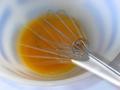
| 12/02/2004 12:26:30 AM |
Dancing whiskby GinaRothfelsComment: Beautiful combination of pastel colors, and certainly a low tech implement! I am wondering if the motion component was even necessary here? Or maybe done with motion blur instead of stroboscopic motion? Very nice aesthetics overall. |
| Photographer found comment helpful. |
| 12/01/2004 12:15:29 PM |
|
| Photographer found comment helpful. |
| 12/01/2004 12:10:14 AM |
Go To Your Room, NOW, Young Man!!!by SkipComment: Congrats on your 5th place finish Skip. I keep telling them to give out at least 6 ribbons each time. They keep saying they can't afford all those ribbons. ;) |
| Photographer found comment helpful. |
Home -
Challenges -
Community -
League -
Photos -
Cameras -
Lenses -
Learn -
Help -
Terms of Use -
Privacy -
Top ^
DPChallenge, and website content and design, Copyright © 2001-2026 Challenging Technologies, LLC.
All digital photo copyrights belong to the photographers and may not be used without permission.
Current Server Time: 07/26/2026 11:09:24 PM EDT.