| Image |
Comment |
| 04/10/2005 11:38:35 PM |
The Lookby zagmanComment: Returning for comment. Great pose/look! Good clarity too. I think a tighter crop would bring this a higher score (and a larger post--use closer to the 640 maximum in the longest dimension). |
| 04/10/2005 11:05:15 PM |
Tessaby TelehubbieComment: Revisiting for comment. Beautiful portrait. Great detail and colors. Bumping up. |
 Photographer found comment helpful. Photographer found comment helpful. |
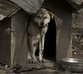
| 04/10/2005 11:04:22 PM |
The Family Dogby aplomb76Comment: Revisiting for comment. Really great shot--I really love the desaturated tones here. And the light and composition gives it such character. Bumping up! |
| Photographer found comment helpful. |
| 04/10/2005 04:59:25 PM |
|
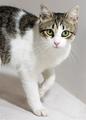
| 04/10/2005 04:55:54 PM |
Miss Chipsby graphicfunkComment: Revisiting for comment. Excellent cat portrait. Lighting is perfect, as is composition. At first, the table edge or whatever the corner line is seemed a distraction, but I really do like the two toned split it provides the shot: lighter on the bottom surface, and darker to the right. Bumping up. |
| Photographer found comment helpful. |
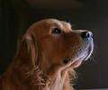
| 04/10/2005 04:53:02 PM |
Normby DCThiessenComment: This is a beatiful shot. I love the pose and the expression. The only improvement to me might have been a bit more light and sharpness in the dogs eyes. Bumping up! |
| Photographer found comment helpful. |
| 04/10/2005 04:51:50 PM |
George by Rando D300Comment: This is a beautiful shot of this dog. I think a portrait mode composition would have worked better and I think using the rule of thirds would have made it more interesting than the centered approach. As composed, the equal balance between dog below his head and space above his head gives me a "chopped" impression on the dogs body--you want to see more. Still, very nice lighting and capture (7) |
| Photographer found comment helpful. |
| 04/10/2005 04:48:06 PM |
Potterby jmsetzlerComment: Well done I like the angle you chose here and the choice of B&W. Good composition, pose, and contrasts. Bumping up. |
| 04/10/2005 04:47:23 PM |
The Divine Ms. Pby L1Comment: Well done Good composition, pose, and contrasts. One of my top picks for ribbon. Bumping up. |
| Photographer found comment helpful. |
| 04/09/2005 12:37:05 AM |
B...raby carodaniComment: LOL! Great idea, well executed. I think we have a winner! Good luck. |
| Photographer found comment helpful. |
Home -
Challenges -
Community -
League -
Photos -
Cameras -
Lenses -
Learn -
Help -
Terms of Use -
Privacy -
Top ^
DPChallenge, and website content and design, Copyright © 2001-2026 Challenging Technologies, LLC.
All digital photo copyrights belong to the photographers and may not be used without permission.
Current Server Time: 06/17/2026 06:33:03 PM EDT.