| Image |
Comment |
| 09/11/2005 02:34:01 PM |
|
 Photographer found comment helpful. Photographer found comment helpful. |
| 09/11/2005 01:16:58 AM |
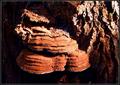
the Decayed and the Livingby madhatterComment: Greetings from the Critique Club!
This is an interesting idea, and the colors are striking. Sharpness looks good to me, as does composition. The lighting and contrast present a bit of a harsh look, but they do present this as sort of an "abstraction" of the pattern, if that's what you had in mind.
The extra plant matter on top of the fungus isn't contributing to the pattern though. And the dark areas in this hight contrast shot are empty of any shadow detail. It almost seems like it's struggling in-between trying to be an artsy abstract, and a straight shot of nature. Perhaps pushing the envelope, and your design, one way or the other might move you up a few notches in the rankings and scores.
Keep shooting!
|
| Photographer found comment helpful. |
| 09/11/2005 01:02:44 AM |
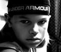
Dangerous & Littleby bobdaveantComment: Greetings from the Critique Club!
This is a very striking image with a very strong "impact", with equal contributions from the subject's intense gaze and the photo capture and production. I think you've chosen the correct composition here: the centric subject works best here. On the other hand the background on the viewers right isn't really contributing to the photo--it might even be considered distracting. You could play with some crops on the right, which may or may not improve this already fine shot.
Excellent work!
|
| Photographer found comment helpful. |
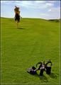
| 09/07/2005 01:15:13 AM |
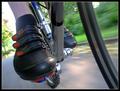
Clipped In by exbionicComment: Congratulations! Finally a bike shot in the winners circle. I assume you did this similarly to the way I did mine for speed--by mounting the camera to the bike (I attached via my monopod to do it).

But you got such a great angle there, I'd love to see the setup.
Congratulations! |
| 09/07/2005 01:11:37 AM |
|
| Photographer found comment helpful. |
| 09/07/2005 01:10:19 AM |
Break Free by elsapoComment: What a great shot! Congratulations on your first ribbon. I knew you had one coming soon--actually, many! |
| Photographer found comment helpful. |
| 09/06/2005 09:29:06 AM |
|
| Photographer found comment helpful. |
| 09/06/2005 09:04:25 AM |
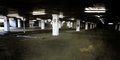
18449a_sm.jpgby KiwiChrisComment: I like it as is, it's sort of naturally grungy. But some added grunge may work too! Title of this should be "12"! |
| 09/06/2005 12:04:55 AM |
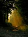
Ray of Lightby smilebig4me1xComment: I have been looking to take a shot like this, but never have managed to pull it off. You've done it perfectly here. One minor suggestion to consider: wheras the foreground does serve to set the scene, I think it might have more impact if you crop at the bottom to just below the first bright reflections; but not having done it here, it may not in fact be better that way--if you want, just try it and assess whether it works! |
| Photographer found comment helpful. |
| 09/06/2005 12:01:22 AM |
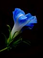
Burst of Blue 1by smilebig4me1xComment: This is beautiful! Striking color, great composition, and lovely contrast between the blue and subtle white tones of the flower. Title is perfect as well. |
| Photographer found comment helpful. |
Home -
Challenges -
Community -
League -
Photos -
Cameras -
Lenses -
Learn -
Help -
Terms of Use -
Privacy -
Top ^
DPChallenge, and website content and design, Copyright © 2001-2026 Challenging Technologies, LLC.
All digital photo copyrights belong to the photographers and may not be used without permission.
Current Server Time: 06/15/2026 03:00:15 AM EDT.