| Image |
Comment |
| 09/12/2005 12:34:34 AM |
|
 Photographer found comment helpful. Photographer found comment helpful. |
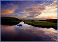
| 09/11/2005 09:22:11 PM |
Times Forgottenby phinbobComment: Very nice. It is perhaps a bit too high contrast--the clouds have posterized in the background. |
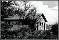
| 09/11/2005 09:21:05 PM |
A Summer Afternoonby jenesisComment: Great use of light. I think this would work best square--I don't see the benefit of all the negative space on the top. |
| Photographer found comment helpful. |
| 09/11/2005 09:20:06 PM |
|
| Photographer found comment helpful. |
| 09/11/2005 06:09:08 PM |
Remenisingby leafComment: This picture shows a wonderful "soft texture" to it. The lighting and colors are fantastic, and the subject is interesting.
I am mixed about the centric nature of the composition. The background here does seem to add to the image, but the centered almost all there composition isn't as strong as it could be. I think it would be worth trying to crop the photo and wall out on the right, and make a squarish format portrait of her with no background. It seems to look good when I cover it with my hand. Try it and judge--it may or may not be better. Message edited by author 2005-09-11 18:09:23. |
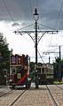
| 09/11/2005 05:23:49 PM |
Beamish1by p2jvrComment: Good choice of subject for the time capsule challenge. Shot looks sharp enough without being oversharpened.
Suggestions. The composition on this could be improved by cropping in on the trolleys. That would bring them closer, and their detail would make the subject stronger. You don't need more sky than the lowest power pole--it identifies the electric source of the trolleys and is the nicest of the two. A slight crop of the right will get rid of a little bit of some car or something edging into the picture. Finally, some work on the shadow detail would be good--you might be able to do a simple adjust using the shadow highlight filter of PS CS.
Hope that helps! |
| Photographer found comment helpful. |
| 09/11/2005 02:34:01 PM |
|
| Photographer found comment helpful. |
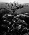
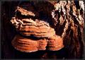
| 09/11/2005 01:16:58 AM |
the Decayed and the Livingby madhatterComment: Greetings from the Critique Club!
This is an interesting idea, and the colors are striking. Sharpness looks good to me, as does composition. The lighting and contrast present a bit of a harsh look, but they do present this as sort of an "abstraction" of the pattern, if that's what you had in mind.
The extra plant matter on top of the fungus isn't contributing to the pattern though. And the dark areas in this hight contrast shot are empty of any shadow detail. It almost seems like it's struggling in-between trying to be an artsy abstract, and a straight shot of nature. Perhaps pushing the envelope, and your design, one way or the other might move you up a few notches in the rankings and scores.
Keep shooting!
|
| Photographer found comment helpful. |
| 09/11/2005 01:02:44 AM |
Dangerous & Littleby bobdaveantComment: Greetings from the Critique Club!
This is a very striking image with a very strong "impact", with equal contributions from the subject's intense gaze and the photo capture and production. I think you've chosen the correct composition here: the centric subject works best here. On the other hand the background on the viewers right isn't really contributing to the photo--it might even be considered distracting. You could play with some crops on the right, which may or may not improve this already fine shot.
Excellent work!
|
| Photographer found comment helpful. |
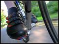
| 09/07/2005 01:15:13 AM |
Clipped In by exbionicComment: Congratulations! Finally a bike shot in the winners circle. I assume you did this similarly to the way I did mine for speed--by mounting the camera to the bike (I attached via my monopod to do it).

But you got such a great angle there, I'd love to see the setup.
Congratulations! |
Home -
Challenges -
Community -
League -
Photos -
Cameras -
Lenses -
Learn -
Help -
Terms of Use -
Privacy -
Top ^
DPChallenge, and website content and design, Copyright © 2001-2026 Challenging Technologies, LLC.
All digital photo copyrights belong to the photographers and may not be used without permission.
Current Server Time: 06/12/2026 10:00:33 PM EDT.