| Image |
Comment |
| 12/12/2005 12:51:04 AM |
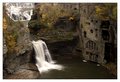
18/10 by Keith ManiacComment: This is really beautiful; congratulations. I was thinking of trying your shot from before, but I sat out instead. I could not have topped this though. Excellent layout and tones. I still plan to try this to see if I can come anywhere close to this beauty! Nice work! |
 Photographer found comment helpful. Photographer found comment helpful. |
| 12/12/2005 12:40:15 AM |
Geléeby Dax-Comment: Oops--Bea, I should have guessed it was you rather than Ursula (another DPC photographer I admire, as well as you!).
But this is right within your style, and it's beautiful as well. I was thinking this would ribbon (I gave it a 10). Still top 20 is very good! Congratulations!
Ok, now I'll go edit my stupid comment below, and add this beauty to my favorites! |
| Photographer found comment helpful. |
| 12/11/2005 11:09:05 PM |
|
| Photographer found comment helpful. |
| 12/11/2005 10:00:05 PM |
|
| Photographer found comment helpful. |
| 12/11/2005 08:55:02 AM |
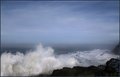
The Stormby Faye PekasComment: I think this is one of those shots that looks good reduced, but the real charm is in the enlargement. I can see traces in the small version that it has beautiful subtleties that will really shine in a large version. Both the sky and the water have areas of lovely pastelish color changes.
Looks like it should be enlarged and treated a bit like an oil painting. Perhaps printed on canvas (though I've yet to do that so I don't have experience on how it will come out!)
Beautiful work. |
| Photographer found comment helpful. |
| 12/10/2005 11:59:35 PM |
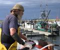
Tuna Fishermanby Faye PekasComment: This photo is an instant classic. The foreground/background composition is exceptional in its story telling and scene settings. Great colors, sharpness, everything!
It's hard to suggest anything to do with this, as I believe it's near perfection. However, something to try and compare with this one to see if it helps or hurts: burn in the elbow a touch, it's very bright, and dodge his face a bit, to add some light. Do the elbow last--because that might be a mistake. One thing good about it "bright" is that it does set the scene for this fellow working in the "hot sun" all day.
Great work--I think I have a new favorite!
Ooh, better yet: I just looked at the date, and it was shot on my birthday. So thanks for this nice birthday present ;) |
| Photographer found comment helpful. |
| 12/10/2005 04:32:17 PM |
sunflower.jpgby vikasComment: This has great colors and color contrast, and I like the composition and softness of the petals. This version seems very low resolution though--and it shows as loss of clarity in the center area of the flower. Some PS work could be in order, or it may simply be a problem of the reduction.
|
| Photographer found comment helpful. |
| 12/10/2005 04:26:09 PM |
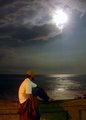
Watcher.JPGby L2Comment: This is a nice, moody image. The major issue here is of course the overexposed moon. You may be able to fix this in PS in several ways (one of which is using multiple layers and setting them to multiply. Or you can do it by burning/cloning. Worst case, grab a moon from another shot!
Other thoughts: the light on the subjects back is nice, but I wonder if the "watcher" theme would have more impact if more light were emphasized in front. E.g., next time take it where it's darker, expose for the moon, and then bracket some longer exposures to get the subjects face. Again, there may be some work you can do in PS that can achieve this without reshooting. Message edited by author 2005-12-10 16:28:25. |
| Photographer found comment helpful. |
| 12/10/2005 10:47:17 AM |
White36.jpgby robin_r_mitchellComment: This is beautiful! Very well done, and I'm surprised this has gone for a year without comments.
Technical. One little thing you might do to improve this is to desaturate it, it shows a little bit of blue haloing, though after removing it you should compare them, it may even add some to the aesthetic effect. |
| 12/10/2005 10:35:55 AM |
|
| Photographer found comment helpful. |
Home -
Challenges -
Community -
League -
Photos -
Cameras -
Lenses -
Learn -
Help -
Terms of Use -
Privacy -
Top ^
DPChallenge, and website content and design, Copyright © 2001-2026 Challenging Technologies, LLC.
All digital photo copyrights belong to the photographers and may not be used without permission.
Current Server Time: 07/30/2026 08:15:29 AM EDT.