| Image |
Comment |
| 12/10/2004 12:56:30 PM |
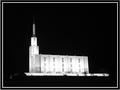
Temple at Night illuminatedby trainComment: Composition: 7
Technical: 8
Appeal: 8
Challenge: 10
Overall Calculated Average Score: 8, Interesting to say the least. Maybe too much neg space and not enough foreground. |
| 12/10/2004 12:54:26 PM |
The Hospitalby OneSweetSinComment: Composition: 5
Technical: 5
Appeal: 5
Challenge: 9
Overall Calculated Average Score: 6, Difficult shot with the bright signs and dark walls. Nice attempt but it turned out kind of mundane. Maybe a different prospective would have helped you. |
| 12/10/2004 11:50:10 AM |
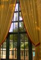
Parisian Viewby admart01Comment: Composition: 5, Tower almost completely overpowered by window and curtains.
Technical: 6
Appeal: 4, Subject not prominent enough.
Challenge: 8, Weak due to composition.
Overall Calculated Average Score: 6 |
 Photographer found comment helpful. Photographer found comment helpful. |
| 12/10/2004 11:48:07 AM |
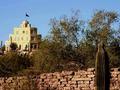
Tovrea Castle, Phoenixby BAMartinComment: Composition: 6, Building and cactus on opposite sides of frame. This is distracting to me.
Technical: 6, Main subject is softer than foreground cactus. Use shorter depth of field.
Appeal: 5, Doesn't really keep my interest.
Challenge: 7, Weak due to composition.
Overall Calculated Average Score: 6 |
| Photographer found comment helpful. |
| 12/10/2004 11:24:45 AM |
|
| Photographer found comment helpful. |
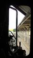
| 12/10/2004 11:21:46 AM |
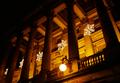
ALL ABOARDby kirtiebuComment: Composition: 6, IMO the window frame in center of the pic doesn't work for you.
Technical: 6, Appears tilted to the right.
Appeal: 6
Challenge: 6
Overall Calculated Average Score: 6, Minor changes could have helped this a lot. |
| Photographer found comment helpful. |
| 12/10/2004 10:50:38 AM |
Peace Towerby Dim7Comment: Composition: 8, IMO, the foreground is overpowering main subject.
Technical: 8, Main subject looks softer that foreground, losing a lot of WOW factor.
Appeal: 9
Challenge: 10
Overall Calculated Average Score: 9 |
| Photographer found comment helpful. |
| 12/10/2004 10:46:19 AM |
The Drakeby banmornComment: Composition: 8, I don't like the roof in the lower right.
Technical: 6, Sky doesn't look real, is it over saturated?
Appeal: 6
Challenge: 10
Overall Calculated Average Score: 8 |
| Photographer found comment helpful. |
| 12/10/2004 10:44:23 AM |
like a phoenix.......RFKby coolharComment: Composition: 8, IMO, the sky should go all the way across in this view.
Technical: 9, May be cropped a little close for best impact on viewer.
Appeal: 7
Challenge: 10
Overall Calculated Average Score: 9 |
| Photographer found comment helpful. |
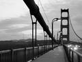
| 12/10/2004 10:41:57 AM |
Golden Gate Bridge and Sutro Towerby faidoiComment: Composition: 8, IMO the cable on the left is too prominent.
Technical: 8
Appeal: 7
Challenge: 10
Overall Calculated Average Score: 8, Would like to see original in color. Sunrise/Sunset? |
| Photographer found comment helpful. |
Home -
Challenges -
Community -
League -
Photos -
Cameras -
Lenses -
Learn -
Help -
Terms of Use -
Privacy -
Top ^
DPChallenge, and website content and design, Copyright © 2001-2026 Challenging Technologies, LLC.
All digital photo copyrights belong to the photographers and may not be used without permission.
Current Server Time: 07/16/2026 11:43:21 AM EDT.