| Image |
Comment |
| 10/24/2003 05:11:18 PM |
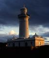
South Head Lighthouseby stuartComment: Nice capture! I love the clouds behind, especially the range and tone of the blues. The lighting is nice, gives it a slightly brooding atmosphere. Nice clean lines, interesting shape interaction. I do wish the overall image was a little sharper though. Other than that, great job. 7 |
| 10/24/2003 05:09:35 PM |
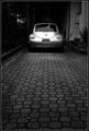
Anyone?!?by NukktaComment: Nice composition, though I do find the items on the counter and left wall a little distracting. The color is nice, it has a warm hue to it. Lighting is fantastic. Focus is alright, would like it a touch sharper. I'm not sure I'm following the title.. but that's neither here nor there really. Good solid image. 6 |
 Photographer found comment helpful. Photographer found comment helpful. |
| 10/24/2003 05:06:08 PM |
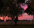
Sunset Lightby sherryk471Comment: Gorgeous colors, I love skies like these. The composition is nice - I like the country feel of it. The lighting is okay, my main dislike is the soft focus. With the trees so close I wish they had a more stark look against that fabulous sky - clear deliniated lines, etc. 6 |
| Photographer found comment helpful. |
| 10/24/2003 05:03:42 PM |
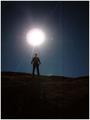
Moonlight Marauderby JPRComment: I love the stars in the back ground and the deep color of the sky. I wish the figure was more in a silhouette though - the moonlight is so bright that I can see flesh tones of the face. Also, the moonrays detract from the image for me, I'm not sure if it would've been possible to not have them - particularly from the perspective the photo was taken (which I like btw) Good solid photo. 5 |
| Photographer found comment helpful. |
| 10/24/2003 04:59:10 PM |
Rageby BeagleboyComment: Fantastic image. The lighting really helps to promote the feeling of rage - great use of color as well. The silhouette, even without an ax, gives a nice feeling of menace. I think this image would've done very well in the dreams/nightmare category too. Definte emotional connection visually. My only issue is the figure doesn't appear very crisp, and I wish he did. I do think the soft focus fits the image well - this is just a personal preference. Great job on the intense image. 10 |
| Photographer found comment helpful. |
| 10/24/2003 04:54:09 PM |
harshby JenHallComment: An interesting image. The lighting is good - I can see a connection between its harshness and the broken glass, but I'm not sure the two together give me that 'harsh' feeling. The focus looks great, the darker colors help the feeling of the piece. I'm not sure I like the composition though - I keep wanting to see something along the bottom to help frame up the image of the glass. Not sure why. Nicely done. 6 |
| Photographer found comment helpful. |
| 10/24/2003 04:49:37 PM |
Waiting for the Sunby wickedpeteComment: Great color, focus looks good. I think the shot may be a little over exposed because of the intense glare on the cement piece (not sure if that's the right terminology). I had that problem when I did a shot with shadows & light. The light rays in this case detracts for me. I like the concept, but it doesn't get my attention fully engaged. I do like the perspective. 6 |
| 10/24/2003 04:35:22 PM |
Midnight Bluesby ArtifactsComment: The focus on this is excellent. Its a simple composition but the clarity and lovely blue shade gives it a little something. I think this would make a very nice stock photo, has a good general appeal in my opinion. Lighting is great and I think the blue hue really helps make the piece. Well done. 8 |
| Photographer found comment helpful. |
| 10/24/2003 04:29:43 PM |
Early Morning Lightby dan_pendletonComment: Very nice image! I love the color of the sky it has a nice richness to it. The sun rays/lighting is great - I like the rays coming outward, wish the sky was just a little brighter though. Silhouettes are always a favorite of mine. I think compositionally the photo is good, though I would suggest trying to get it with only the scraggly trees in it. The leaf-filled tree in the bottom left pulls away from the pristine silhouette. Other than that, I think its fantastic. 7 |
| Photographer found comment helpful. |
| 10/24/2003 04:25:21 PM |
Driveways Wantedby jimmythefishComment: Excellent light usage, focus is perfect and the use of distance really furthers the photo's interest level. Black & white was a great choice. My only minor suggestion would be to crop the bottom up just a bit. As it starts to blur out I think it isn't necessary to the picture - still strong distance perspective available. Very well done image - I could easily see it as a car ad in a magazine. 10 |
| Photographer found comment helpful. |
Home -
Challenges -
Community -
League -
Photos -
Cameras -
Lenses -
Learn -
Help -
Terms of Use -
Privacy -
Top ^
DPChallenge, and website content and design, Copyright © 2001-2026 Challenging Technologies, LLC.
All digital photo copyrights belong to the photographers and may not be used without permission.
Current Server Time: 07/18/2026 10:22:21 PM EDT.