| Image |
Comment |
| 04/06/2006 08:15:32 PM |
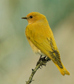
"Yellowbird" of Happinessby hahn23Comment: Beautiful bird, wonderfully captured. The detailing in the wings is excellent, very nice focus. The color is lovely. It is a very nice bird capture. I wish the color was a bit brighter or there was a little more light, the bird seems I don't know.. not dull but like there's more potential for a little more oomph in the richness or brightness of the yellow. 6 |
 Photographer found comment helpful. Photographer found comment helpful. |
| 04/06/2006 08:13:02 PM |
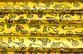
The Golden Stairsby KitaComment: Is this Golden as in Golden Books? Took me a while to figure out the reference, but now that I have it brings back great memories. I love the nice golden color, the lighting is perfect, the focus is excellent which is necessary for a closeup like this. I love the worn edges, gives the feeling the books have been used - though I'm not sure if everyone would know these are books just from the image. Still the fun drawings on the gold foil spines is fun and interesting. I think cropping off that last book at the bottom and the beginning of the next one at the top might tie the whole thing up nicely since there are some slight focus flaws on those two areas. Nice simple set up that has been well executed. 6. |
| Photographer found comment helpful. |
| 04/06/2006 08:09:52 PM |
Exclusive Spy Photo! Cheddar Cow Captured!by C_Steve_GComment: Ha! Great image. I always wondered why cheddar cheese was yellow, now I know! Nice color, clarity is great, ambient light looks a bit low but it works very nicely. Love the humor of the image and the composition is simple but well executed. 7. |
| Photographer found comment helpful. |
| 04/06/2006 07:37:18 PM |
clownin' aroundby hopperComment: What a mischevious image. I love the contrast of the wild clowny hair versus the fairly bland colored clothing. The pose is great, very impish look that fits with the silliness of the hair. I like the background colors, they don't interfere with the subject at all. There seems to be a bit of haloing around the subject which is a bit odd. Also, though it looks as if this was taken outside so it may not have been an option, I wish there were some fill light on the front of the model. Nothing too much, but just to give a bit more luminescence to the skin and more pop to the model as a whole. Very nice. 6 |
| Photographer found comment helpful. |
| 04/06/2006 07:33:55 PM |
Sunriseby karmatComment: I like the concept for this. I think the composition is great, love the negative space at the top. The lighting I'm not so sure really worked here. It looks as if it is being lit from underneath, which I think is creative and gives an interesting dimension, but there are some odd shadowing effects that creates which makes the petals look a bit dingy. The focus is also very soft, which could be attributed to the lighting as well. If this were sharper the impact would likely be even greater. 5. |
| Photographer found comment helpful. |
| 04/06/2006 07:31:33 PM |
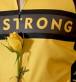
LiveStrongby MelethiaComment: Focus is excellent. Color is nice, though a little bit washed out in some areas probably because of the lighting, which is good but maybe a smidge harsh. Its an interesting image, the rose seems a little out of place to me, but I don't know much about the LiveStrong foundation so maybe there's a significance I'm unaware of. If it was added to give more elements to the image, I'm not sure it succeeded since as a viewer I think it looks odd. Still its nicely rendered and just the shirt may have been too barren. A solid image. 6 |
| Photographer found comment helpful. |
| 04/06/2006 07:27:25 PM |
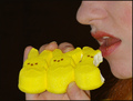
Easterby thomaspeopleComment: It is certainly yellow but there is not much else that draws me into this image. The clarity is a bit off (focus seems rather soft) and that might be because yellow is a pain in the tush to get good detail out of for some reason. The lighting seems a bit harsh, but there are no annoying shadows present so it works. I think the biggest thing for me is the composition doesn't have a high impact. I'm thinking the main problem is the hand holding the Peeps. Maybe if they were on a fork or something slender like a skewer so that the Peeps would be more central, there would be more negative space around them and then the addition of the models partial face would have an even higher impact, IMO. Also that bid of reddish-brown in the bottom right-hand corner (probably the model's hair?) is a bit distracting. I think - following the concept mentioned above - having that be all black background would help give more emphasis and focus on the two main subjects.. Peeps and mouth eating them. I gave a 4 |
| Photographer found comment helpful. |
| 04/06/2006 07:22:16 PM |
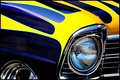
Chevyby dahkotaComment: Excellent use of natural (I'm assuming) light, great focus. Love the clarity, the color contrasts are wonderful and nicely captured. Fits the challenge. I'm not much of a car person but the different curves and colors and flow of the image does draw me in, as well as the contrast of the shiny metal and headlight. Looks as if you can see if not you, someone in the headlight. I'm not so sure it distracts from the image though. The composition is good, but I held a hand up to block out that tire and I found the power to be much greater when cropped right before that tire starts. I think the extra metallic color distracts but more importantly it lessens the impact of the grill and headlight's coloring. 6 |
| Photographer found comment helpful. |
| 04/06/2006 07:17:40 PM |
by BradComment: I love the idea behind this. I adore the curves and how well you highlighted them and brought them to attention. The lighting is very good (I wonder if more backlight might've brought those curves out even more? That's a legitimate question not a backhanded suggestion btw! :D ) I think the border is a little big, but it does help reinforce that nice horizontal line and bring the subject into higher prominence. The focus is good but there are areas where its soft along the flowers lip line. Finally I think the mottled background is great, but I wish it was uniformly green mottling rather than with that yellow streak and bit of light blue in the back. The various shades of mottled green make an excellent background. 8. |
| Photographer found comment helpful. |
| 04/06/2006 07:13:43 PM |
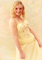
Golden Girlby Prof_FateComment: Great portrait. The coloring and softer focus works really well here. The background is nicely unifying without being too much. Lovely dress with a lovely model wearing it. The pose is a little odd, she seems a bit off-kilter and while she doesn't exactly look uncomfortable (great smile!) the positioning makes ME feel like its uncomfortable. I like that her skin doesn't look sallow nor overly pink - nice tones there. I wish there wasn't that hot area on ther shoulder but still a very nice image. I do wonder if it might feel a bit more finished off presentation wise with a slightly thicker black border. That is very much a "hmm" thing than a detriment though. I gave a 7. |
| Photographer found comment helpful. |
Home -
Challenges -
Community -
League -
Photos -
Cameras -
Lenses -
Learn -
Help -
Terms of Use -
Privacy -
Top ^
DPChallenge, and website content and design, Copyright © 2001-2026 Challenging Technologies, LLC.
All digital photo copyrights belong to the photographers and may not be used without permission.
Current Server Time: 07/18/2026 01:09:07 AM EDT.