|
|
|
Showing 251 - 260 of ~1207 |
| Image |
Comment |
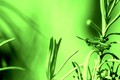
| 04/11/2006 12:26:14 AM | Do it!by macrothingComment: Great image! I really like the color tone you've used too, I don't normally like neon green but the almost metallic feel of it gives the shot a certain something. I think the focus and light work nicely with the coloring. The grasshopper really looks great under this tone and I love the varying intensity of the green all over the image, definitely adds a different dimension. Unusual look but I really am enjoying it. 7 |  Photographer found comment helpful. Photographer found comment helpful. |
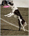
| 04/11/2006 12:23:49 AM | Caught!by jenesisComment: Heh, lazy pup, just standing up to get it! Nice capture. I like the tones, especially since they make the frisbee stand out even more and draw your eye to the action. Focus looks pretty good to me and the natural light works well here. The feet in the upper left corner are a smidge distracting, especially since the frisbee is bring attention to that area, a shift slightly to the right might have eliminated them and given that nice length of white all the way across. Also I'd probably crop about half of the soft focus off the bottom, that way much of it is gone, but there is still room at the bottom so the dog's feet don't look cramped. 5 | | Photographer found comment helpful. |
| 04/11/2006 12:19:21 AM | Fearlessby ShaneBlakeComment: Great lighting and focus! I love the joy you can see on his face, very emotive. The colors are vibrant, the red balls are a bit too saturated though (I don't know if they were boosted or not, but they seem very contrasty compared to the blues). I'm not sure if you could've manuevered to get a better background either - if there was an entire wall of that red stuff that may have worked - the parking lot in the back doesn't add anything to the image and gives it more of a snapshot feel. I think a different background would give this shot much more appeal. 4 | | Photographer found comment helpful. |
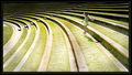
| 04/11/2006 12:13:47 AM | A Hop, Skip & A Jumpby manic35Comment: Fabulous lines and curves in this. I really like the uniformity first off and then how its broken up by the young girl. Fits the challenge prefectly and has a nice whimsical feel to it, I can image a kid hopping up and down those step thingies easily. The lighting is a bit harsh but I think it actually works for this shot (at least to me), gives those nice shadows on the curves. The color is a bit faded, possibly because of the lighting?, so I wish it was a tad more vibrant but over all I think its excellent. 7 | | Photographer found comment helpful. |
| 04/09/2006 11:57:50 PM | yellow clusterby collie65Comment: This photo definitely meets the challenge, but it is suffering from a number of technical issues. The first is lighting. Natural light can be a pain to work with, either its too bright or not bright enough, not shining where you need it, it goes on. In this case the lighting is not sufficient to highlight the subject or to bring out any interesting details. If possible I would suggest a second light source to try and brighten up the area, or reshoot when the sun is more cooperative. Focus looks like it may be good, but with the low light its hard to make out any details of the flowers which makes it difficult to determine how well focused the image is. As it stands it looks a bit soft, though the main subject does seem to have a tighter focus than the background which is good. Composition could use a bit of work, I say this because you do have an interesting (though often done) subject in these flowers, but the background is competing greatly with them. The busy-ness of the background takes away from the impact your main grouping of flowers (subject) can offer. If you could blur the background out more, I'd suggest into a mass of pale yellow if possible with your camera, I think that would not only help isolate your subject but give an interesting gradient of color from white to yellow in the background. The choice of subject is good, fits the challenge and there is potential here but I think the biggest element causing problems is the lighting which is effecting everything else the most. 3 | | Photographer found comment helpful. |
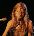
| 04/07/2006 09:14:46 PM | Golden Melodyby DeniseBernadetteComment: Beautiful image, beautiful subject. The lighting is excellent, not sure if you had any say over it or not, but if not it was well utilized, if so, very nicely placed. The clarity is wonderful. Composition is great. There is a slight melancholy to the image, her face looks like there's an underlying sadness somewhere. I think this is captured just wonderfully. The only thing I'd suggest changing is perhaps cropping it just below where her shirt shows on her chest. The reason I say that is much of that microphone in the front is (necessarily) out of focus and that's a bit distracting. Cropping it at her shirtline would get rid of much of that while still allowing the image to breathe. Nicely done. 7 | | Photographer found comment helpful. |
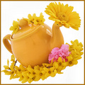
| 04/07/2006 09:10:43 PM | pINkTRUDER ALERTby obsidianComment: Wow. Don't let anyone say you don't meet the challenge. Hehe. I like the composition for the most part. The flowers are very nice as is the teapot. The combination of the two makes for some nice interest. I'm not sure I like the white background. It seems a little too much and makes the subjects feel like they aren't grounded anywhere. I do like the tilt of the subjects though. I could see this being a nice stock picture as well, it is technically nicely done and has a bit of whimsy. Not a fan of pink so I'm not too sure if I like the carnation or not. it does add a nice punch and breaks up all that yellow. The focus is also a little bit soft in some areas, not sure why though. 6 | | Photographer found comment helpful. |
| 04/07/2006 09:07:08 PM | Bumble Beeby sherpetComment: Awww. Very cute. I love all the different points of interest in this image too. The addition of the flowers is excellent, really gives the image some more depth rather than just being a flat photo of a bear in a costume. They also add a nice contrast color with the white while still tying in with the theme (bear bee) and having the yellow compliments. To me, the lighting looks a bit harsh. I'm not sure if having a light set somewhere else to add fill and get rid of some of the shadowing on the right would help, or if simply softening the light with a piece of drafting paper or tissue paper over the light would help more. I think the light is also what is making the focus just a smidge soft. Overall its got some excellent focus but it doesn't have that tack-sharp POP that is achieveable. Finally I think the blue background - though a nice contrast - competes too much with the yellow. Its like they feed off each other to see who can be brighter, not sure if that makes sense. Though there is plenty of black in the costume of the bear, I think a black background would've been a good choice, especially since the main colors, the white, the bright yellow and the honey-brown of the bear and whatever its sitting on are excellent contrasts with black. With a fill light or two, you might not lose the antennae against a black background - take that with a grain of salt though, I'm no expert! - 6 | | Photographer found comment helpful. |
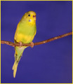
| 04/07/2006 09:00:53 PM | Parakeetby angela_packardComment: I love the color combinations, well chosen. The color is good as is the lighting. The composition is simple and very nice. I think the border is a bit too much yellow, a black border might have tied it all up better. There is an oddness to the focus.. it looks like the stick is well focused and parts of the parakeet as well, but others have a smudgy quality. Perhaps due to compression, not sure. A solid photo. 6. | | Photographer found comment helpful. |
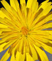
| 04/07/2006 08:58:49 PM | Naturalby SteveinnzComment: It looks like a gigantic sun! I like the composition of this, the full on view with the petals splaying out towards the viewer. The colors are very nice, and it certainly meets the challenge. The lighting is a bit harsh though. It looks like you're using natural light so I'm not sure how possible using a handheld diffuser would be, but that would give a more even soft light that would get rid of (partially) the harshness of the lighting and some of those less than attractive shadows. The background makes for a nice contrast, but there's an odd.. dirty quality to it along the bottom, some brownish or grey cast, not sure what that is. Also the fact that the background has a very noticeable change from black to blue is a little distracting. A uniform background would definitely help, and if I were choosing I'd probably go with either a darker blue, black, dark green, something that's going to set off that yellow even more. The focus is too soft for an image like this, particularly with the way it is set up. This, to me, begs for clear, sharp focus so each of the petals are nicely deliniated which would also highlight the nice wheel of pattern it has. 4. | | Photographer found comment helpful. |
|
Showing 251 - 260 of ~1207 |
Home -
Challenges -
Community -
League -
Photos -
Cameras -
Lenses -
Learn -
Help -
Terms of Use -
Privacy -
Top ^
DPChallenge, and website content and design, Copyright © 2001-2026 Challenging Technologies, LLC.
All digital photo copyrights belong to the photographers and may not be used without permission.
Current Server Time: 07/17/2026 03:46:54 PM EDT.
|