| Image |
Comment |
| 07/31/2006 02:55:56 AM |
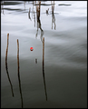
Fishing is my path to Enlightenmentby edmengComment: Very nice. I like the left-centric composition. The long lines of the reeds is great, especially how they contrast to the more jagged or curvy sticks above it. The still-ish water helps bring a feeling of peace to the image and the bobber thingie helps save the image from being a complete wash of grey and brown boringness. It really helps emphasize the rest of the image. I gave a 7 |
 Photographer found comment helpful. Photographer found comment helpful. |
| 07/31/2006 02:54:25 AM |
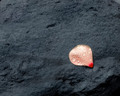
vibrationsby smccComment: While this wouldn't qualify as completely still, I think the rhythm of the ripples is very zen-like. Brings to mind the chanting that many associate with meditation. I thik the flower is lovely though some of the detail seems muted in its redness. The background makes for a nice contrast to the pop of color and I'm glad that you left some of the still water on the outskirts of the ripples. It helps center the image and IMO gives it an even greater tie to Zen. I gave a 7 |
| Photographer found comment helpful. |
| 07/31/2006 02:52:33 AM |
|| Chittakshana || A Moment Of Awarenessby TejComment: Excellent. I love the color contrast. I like the drops of water. I like the contrast between the silky smooth petal and the rough rocks. I think this does have a zennish feel though I wish the petal were a bit more cornered rather than edging so close to be centered. I do like the way you left that corner that drops off in the image, it helps break up the large stone mass and saves it from being just a boring petal on a rock. I gave a 7 |
| Photographer found comment helpful. |
| 07/31/2006 02:50:56 AM |
The silence of the tidal sandsby coolblueComment: Very delicate. I like the choice you picked for your subject. It has a great organic feel and a lot of interest with the textures. I do think it feels zennish as there is a bit of a pattern to the texture that helps calm things down. The lighting is good but I wish there were a a bit more shadows to help add to the feeling of depth. I gave a 7 |
| Photographer found comment helpful. |
| 07/31/2006 02:49:49 AM |
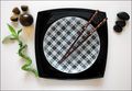
"Nourish the Soul"by ThaiComment: There's a wonderful feeling of order to this. It has a lot of different elements and yet it does not feel noisy or overly busy. The clean lines and shapes work very well together, the contrast between sharp corners and rounded edges is nicely balanced which helps this feel zen to me. I gave a 7 |
| Photographer found comment helpful. |
| 07/17/2006 04:24:07 PM |
Bulbby MudHutComment: Lovely lighting, great focus and nice composition for the most part. That said I find myself adjusting my window so I can crop out most of the left side of the screen. That moves the attention to the main subject and leaves nothing to distract my eye. I think it makes the image stronger, so I'd suggest a tighter crop, perhaps and inch out from the most bulbous portion of the onion. I gave a 7 all the same. |
| Photographer found comment helpful. |
| 07/16/2006 01:45:33 PM |
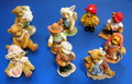
"We may be small but we're Ten in all"by ThaiComment: Very nice figurines. The lighting is good, no really harsh shadowing and the details are all visible. The focus looks good though a touch soft for me. I'm not sure I like the composition though. I see that it makes a 10 but because there are actually 10 figurines I wish they had been put together in a more creative way. Perhaps on something with varying heights to give a number of areas of interest or outside in some sort of teddy bear picnic kind of scene. Something a little more dynamic than on a flat blue surface. Still the technical portion of the image is very well done. I gave a 6 |
| Photographer found comment helpful. |
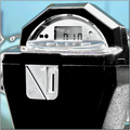
| 07/16/2006 01:42:38 PM |
Metered Timeby JeileenComment: Interesting background for this, I love the color of it and it seems to have some wonky action going on the left side. I like your choice of subject, it is a simple thing but part of everyday life for the most part. I wish the focus was a bit sharper on the numbers though since that is the biggest element in the image (at least in relationship to the challenge) and I think a tighter crop on the bottom would cut out some of the distracting elements that don't add to the composition - the bit of car? in the bottom/side portions. This would also bring the meter's time of 10 even more into the forefront and consolidate the attention there. I gave a 5 |
| Photographer found comment helpful. |
| 07/16/2006 01:38:27 PM |
After 10 years, why not say hi?by bvoiComment: Was this really a reunion? If not, kudos on having the usage of a big gym to set up in! I like the sparseness of the table decor, though I don't know how those little amounts of cheese could possible feed everyone! I think the setting is perfect, the title kind of makes the connection to the challenge more than the image to me. I think the lighting is good, though a bit dark on the right. Great focus/clarity. I love the expression on the man's face and the detail of (what looks like) his gaze on the woman. Very well done. I even like how the decor seems to match your two "models". His blue and the tablecloth and her red outfit with the punch. I don't know if that was purposeful or just a happy accident but it helps tie things together IMO. I gave a 6 |
| Photographer found comment helpful. |
| 07/16/2006 01:34:26 PM |
Quite Passionby AkchasComment: Lovely girl. Fun pose. I like the choice of black and white as it highlights the form better than color in my opinion, I wonder how a mostly desaturated image would look though - not quite B&W, with just a hint of color. The composition is good, though I don't like the very tight crop at the bottom and I wish the focus was a little sharper. I think more soft light on the face and the legs would give her just a bit of a glow that would be pleasing and bring more detail of her face out and help combat the strong light on the right. I think its a good choice for her eyes to be closed or at least really lowered but that and her expression gets lost a bit in the shadows. I'm not sure I'd relate it to a 10 as personal tastes vary but its a nice portrait that is clearly going for a sensual/sexy feel. I gave a 6 |
Home -
Challenges -
Community -
League -
Photos -
Cameras -
Lenses -
Learn -
Help -
Terms of Use -
Privacy -
Top ^
DPChallenge, and website content and design, Copyright © 2001-2026 Challenging Technologies, LLC.
All digital photo copyrights belong to the photographers and may not be used without permission.
Current Server Time: 07/17/2026 12:37:14 PM EDT.