| Image |
Comment |
| 10/20/2003 10:44:46 PM |
Braking The Barrierby sjonniComment: Interesting use of light. Good focus, I like the position of the guitarist, but I have to say the lighting does kill it for me. I think this was a purposeful choice, but my personal preference would've been the intense light behind him, so it cloaked him from behind, giving that feeling of power radiating around the subject. In an aside, it looks like half his face came off and the light burst out from inside.. but I'm kind of weird. :) Strong image, and I've decided it was a conscious light choice, gave a 7 even tho its not my cup of tea, still a gutsy different vein to go in. |
 Photographer found comment helpful. Photographer found comment helpful. |
| 10/20/2003 10:36:17 PM |
Happy Halloweenby rexrodeComment: I understand the composition of the piece, I like it - especially the different background - not many use that lime green. Good use of light. I have to be honest and say I'd like it with only the cat statue though. The lines of the cat are very regal and sensuous and I would love to just see it in silhouette without the pumpkin face. 7 |
| 10/20/2003 10:32:23 PM |
Dusk landingby JeanComment: Gorgeous color, love the light diffusing through the clouds. The plane is focused enough that it looks great against the background, and it does give a nice feel to the image. All that said, I think I would've preferred the plane not to be in the photo - I think the play of light on cloud is strong enough to hold its own. Great capture! 9 |
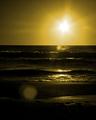
| 10/20/2003 10:29:54 PM |
Ancient Gazeby jkiolbasaComment: I love this image! I especially like the slightly dark, yellow tone of the photo, plus the waves are give it a wonderful movement. The sun ball flares on the beach and water are unfortunate, but I think the overall appeal of the image overcomes those slight imperfections. I can't fully explain exactly what it is that I like about it that really grabs hold for me, but I gave a 9. |
| Photographer found comment helpful. |
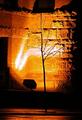
| 10/20/2003 10:25:54 PM |
Tree and Lightby ColeyComment: Nice composition, wish the lightbox wasn't in the photo though. Also find the bright white lights to be distracting. I love the warm orange color and then the stark black of the twiggy tree against it. I also like the reflection on the ground helping to tie the whole composition together. I think it would be better if it was cropped more at the top, the shadows above the ledge draw the eye up and out of the image. Great photo! 7 |
| Photographer found comment helpful. |
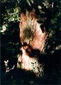
| 10/20/2003 10:23:20 PM |
Weathered Treeby groganComment: This I think has a light written all over it, but I think the photo's interest actually comes from the light on the tree, rather than the tree itself as the tree doesn't have much of an impact on me as a viewer. I like the fact that the tree does have great focus in the areas that are lit. Gave a 5 |
| Photographer found comment helpful. |
| 10/20/2003 10:18:39 PM |
Lightbulbby gakoutComment: Hrm.. a nice rendition of a light bulb. I like the vantage point it is taken from, I also like the over all neutral color tone of the image. I do wish it was larger though, I think detail is lost due to its size - this factor had a negative impact for me. I like the soft focus on the bulb, giving it a nice glow instead of the regular harshness - I think it also helps make it more interesting than it would be if it was in complete focus. 7 |
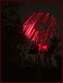
| 10/20/2003 10:15:12 PM |
Magic Windmillby ChrisW123Comment: This is different. I like the contrast of the pinkish red color against the black, but it looks pretty ragged, like scribbles which does detract for me. The reflection? of the red in the trees is distracting a bit too, but that may have been unavoidable. I like the uniqueness of the image as well. 6 |
| Photographer found comment helpful. |
| 10/20/2003 07:39:19 PM |
Blue Ribbonby gandersComment: Hm.. an interesting image. I can't tell what it is, but I like the color. The white is a little glaring, but not so much that it kills the shot. As a personal preference I would've liked a larger field of focus. Other than that, a nice unique use of light and shot altogether. 7 |
| Photographer found comment helpful. |
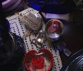
| 10/20/2003 07:37:13 PM |
I wish her well.........by jmritzComment: The title gives me the impression of someone who has broken up and gone away, and so when looking at the assembled items, they are with the light of things left behind. With that view, I really light the muted lighting and the arrangement of the items is good. I particularly like the red and blue coordination. The items in the surrounds I do find a bit distracting, mainly because I'm trying to figure out what they are, sort of get clues about who they could've belonged to - not being able to determine the nature of the items brings me out of the image a bit. Other than that, I really like the composition and subject. I hope I'm reading what you wanted folks to get out of it - if not, well it still works for me! 8 |
| Photographer found comment helpful. |
Home -
Challenges -
Community -
League -
Photos -
Cameras -
Lenses -
Learn -
Help -
Terms of Use -
Privacy -
Top ^
DPChallenge, and website content and design, Copyright © 2001-2026 Challenging Technologies, LLC.
All digital photo copyrights belong to the photographers and may not be used without permission.
Current Server Time: 07/17/2026 10:18:15 PM EDT.