| Image |
Comment |
| 11/18/2004 04:18:40 PM |
Vatican viewby ozimaxComment: Good detail, tone an texture. The hand at the bottom right keeps me looking on that area instead of enjoying the full frame. |
| 11/18/2004 04:16:14 PM |
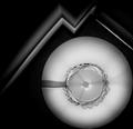
Leeby JSchoComment: Almost a tri tone. I can see sepia and the jacket has a blue tint. Ahh. You only partially desaturated it maybe? Hope you're not being sacrificed for this heresy. I like the low key effect, and truthfully, I think it would have been stronger as a pure duotone or b/w. You did capture an intense look and the lighting is beautiful. |
 Photographer found comment helpful. Photographer found comment helpful. |
| 11/18/2004 04:06:41 PM |
CD Cases and a Lampby aplomb76Comment: Bravo. Just an excellent idea with perfect execution. You could go head to head with Edward S with this one. I have to fav this one. |
| Photographer found comment helpful. |
| 11/18/2004 04:01:35 PM |
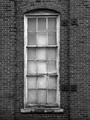
Urban Windowby JelloPhotogComment: Although it is centered, there are a lot of different things on either side to keep it from becoming static. I like the 3-3-3 top to bottom and side by side. Only nit is in the post processing. To much sharpening and not as much detail as all those bricks would imply is really there. |
| 11/18/2004 02:58:30 PM |
Merlotby 77DXComment: Good low key photo. I think I would have liked to see the base of the glass. Other than that, the tones composition and dof are good. |
| Photographer found comment helpful. |
| 11/18/2004 02:51:59 PM |
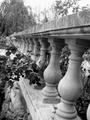
The Secret Gardenby bigfishComment: The tones are good. Darks, lights and lots of mid-tones. It does look a little soft and I don't know about the tilt. Seems to be disorienting to me, like it's running away or rejecting the viewer when I would want it to be welcoming. |
| Photographer found comment helpful. |
| 11/18/2004 02:34:54 PM |
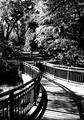
Rampway to heavenby BullpupComment: Curving lines are pleasant to look at and I like the way you framed it. A little to much contrast, imo. There are hardly any mid-tones in the picture. But that is only my opinion. |
| Photographer found comment helpful. |
| 11/18/2004 02:30:15 PM |
Naturalby BudComment: This is a nice portrait. Good lighting and an honest expression. It's well framed. The only thing that isn't perfect is the processing. It looks like compression artifacts and over sharpened. I'm giving it a five, thought I'd give the reason for the score. |
| Photographer found comment helpful. |
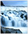
| 11/17/2004 06:38:03 PM |
True to natureby terjeComment: It's pretty with the blues but it looks to much as if it's just a regular picture taken for any other challenge. I've seen the smooth water shots a lot. The oversharpened upper left rock is really distracting. Other than that, if it was another challenge, I'd probably give you a high score. |
| Photographer found comment helpful. |
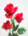
| 11/17/2004 06:24:44 PM |
Floral Studyby EddyGComment: Water drops on glass? I hadn't thought of that before. The whites are pleasant without becoming a distraction by being to hard on the eyes. Thanks for entering. Can't wait to read the notes. |
| Photographer found comment helpful. |
Home -
Challenges -
Community -
League -
Photos -
Cameras -
Lenses -
Learn -
Help -
Terms of Use -
Privacy -
Top ^
DPChallenge, and website content and design, Copyright © 2001-2026 Challenging Technologies, LLC.
All digital photo copyrights belong to the photographers and may not be used without permission.
Current Server Time: 07/24/2026 02:57:09 PM EDT.