| Image |
Comment |
| 07/09/2002 09:17:00 AM |
The Fear of Commitment by RoninComment: Its a creative idea but I'm not entirely happy with the way it was executed. I don't like the white space in the lower left. Also it looks like you only had one light source and there are alot of shadows that probably should have been lit up. |
| 07/09/2002 09:16:00 AM |
Lost Identity!by tjpierreComment: lighting is bland... needs more contrast... if you are going for that open road look you should have probably cropped off the top bit to put more road or raised the camera a bit to get more road. Try to avoid getting only a little of something. Always go for substantial quantity or none at all. |
| 07/09/2002 11:27:00 AM |
|
 Photographer found comment helpful. Photographer found comment helpful. |
| 07/08/2002 09:06:00 AM |
|
| 07/08/2002 08:49:00 AM |
Broadbarred Firefish (has venomous spines)by JeanComment: This is a cool shot of this fish. I love the lines and colors. I just wish, for this challenge, the fear would be more apparent and I wouldn't have to be smacked over the head with a large title. |
| 07/08/2002 09:13:00 AM |
|
| 07/08/2002 09:05:00 AM |
|
| 07/08/2002 08:57:00 AM |
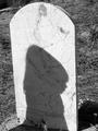
Worst Fearby kevinswopeComment: I like what your photo represents for the challenge, but I'm not happy with the way it was carried out. I'm not entirely sure what I would have enjoyed seeing better. I guess the one thing that bothers me is the brightness of the tombstone. |
| 07/09/2002 11:18:00 AM |
|
| 07/08/2002 09:10:00 AM |
|
Home -
Challenges -
Community -
League -
Photos -
Cameras -
Lenses -
Learn -
Help -
Terms of Use -
Privacy -
Top ^
DPChallenge, and website content and design, Copyright © 2001-2026 Challenging Technologies, LLC.
All digital photo copyrights belong to the photographers and may not be used without permission.
Current Server Time: 07/17/2026 12:35:02 PM EDT.