| Image |
Comment |
| 07/12/2010 07:11:51 PM |
|
 Photographer found comment helpful. Photographer found comment helpful. |
| 07/12/2010 07:10:45 PM |
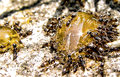
The Surfaceby deezRitzComment: I like the texture of the rock on the bottom right. It feels smooth.
It feels a little too reddish. Though it's probably sunset.
It looks like you got your feet wet for this one! |
| Photographer found comment helpful. |
| 07/11/2010 11:47:35 AM |
Feeding Frenzyby ambakerComment: Not a bad image. What is it they're eating?
I think the whites are a bit blinding. I think it'd've been really interesting to see this shot with only their food (?) on the right from the top looking straight down. I'd say that'd've been an interesting angle. |
| Photographer found comment helpful. |
| 07/11/2010 11:35:23 AM |
Free Pierby wei1108Comment: I think this image is very dark. It's a nice sunset, city horizon and chaotic boat array. |
| 07/11/2010 10:44:04 AM |
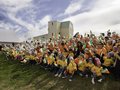
Irish flagby thorb59Comment: I'm Irish. I've totally gotta score this high!
Out of curiosity what was the event that inspred the Irish flags? |
| 07/11/2010 10:44:01 AM |
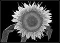
3 By 3 To Grow a Treeby NeVeRynComment: Very nice symmetry here.
I meant to say earlier -- I know it'd be very hard to achieve this, but the green-on-green-ness of this is a bit overpowering. I don't suppose you'd be able to see the ladder of symmetry with a younger tree though. |
| Photographer found comment helpful. |
| 07/11/2010 10:43:52 AM |
|
| Photographer found comment helpful. |
| 07/11/2010 10:43:42 AM |
|
| Photographer found comment helpful. |
| 07/11/2010 10:41:49 AM |
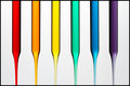
Liquid Spectrum by meneleComment: I did some reading on the colours of the rainbow just now, and wikipedia, at any rate, seems to give 7 colours in the spectrum. It's a big debate, I think, and I'm far from an expert in that field, so I can't justify using that as an excuse to take marks off.
Yours is an excellently composed image. I like the background and the lighting (and I've no idea how you did it!).
My only problem with it is that as the colours narrow at the bottom the... vibrancy of the colours appears to diminish. This might have been intentional but I think I'd've preferred a continuous strength.
You gonna tell us how you did this? :)
9 |
| Photographer found comment helpful. |
| 07/11/2010 10:41:44 AM |
Order in the midst of chaos.by bubbles13Comment: Nice idea. Simple and effective. I think it'll do well.
It'd've been nice if you could have narrowed the DOF to make the letters on front and behind the "ORDER" go blurry - I think opening your aperture (by lowering the aperture number) and maybe a narrower angle might have made this work.
It might be nice too if the image was cropped equally on the right and left. Equally a tighter crop on the left would achieve the same.
"in the midst of chaos" Something just came to me there. The chaos might have been provoked more with a grainy feel over the image. Maybe not. Might be worth trying out.
Phfew. long comment :) |
| Photographer found comment helpful. |
Home -
Challenges -
Community -
League -
Photos -
Cameras -
Lenses -
Learn -
Help -
Terms of Use -
Privacy -
Top ^
DPChallenge, and website content and design, Copyright © 2001-2026 Challenging Technologies, LLC.
All digital photo copyrights belong to the photographers and may not be used without permission.
Current Server Time: 08/09/2026 05:37:41 AM EDT.