| Image |
Comment |
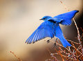
| 03/28/2011 05:43:43 AM |
Freedomby hahn23Comment: I apparently gave this a 4... which I didn't. Hmm. Must've been a recorded keystroke when voting that went from a 4 to yours. Sorry about that.
Fortunately the 6 or 7 I'd've really given it it wouldn't have pushed you to third.
Good shot and congrats on the HM. Message edited by author 2011-03-28 05:44:04. |
 Photographer found comment helpful. Photographer found comment helpful. |
| 03/28/2011 05:25:52 AM |
|
| Photographer found comment helpful. |
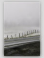
| 03/28/2011 05:22:25 AM |
along the lost highwayby skewsmeComment: The framing doesn't work for me, to the point where it'll be a 7 rather than 8. Just a little too... offputting or something. I can't place my finger on it.
It's hard to say but it might be the outer black border that DPC has on, but regardless I think I'd've preferred to have seen more shot than not :)
Love it all the same though. |
| Photographer found comment helpful. |
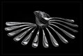
| 03/28/2011 05:17:32 AM |
Pin Palsby meowComment: Now, this I can get behind!
Love it. Tones, textures, bokeh, lighting. 10 and fav. |
| Photographer found comment helpful. |
| 03/28/2011 05:08:37 AM |
|
| Photographer found comment helpful. |
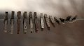
| 03/28/2011 05:04:32 AM |
Lucky 13?by LoViComment: Great concept. Grittyness of the sink feels good. |
| Photographer found comment helpful. |
| 03/28/2011 05:00:04 AM |
My 13 Lucky Matchsticksby jazul02Comment: Good concept. I think that for this style of shot the background has to be very smooth for it not to be distracting. It's a little too creased here, unfortunately, and catches my eye. |
| Photographer found comment helpful. |
| 03/28/2011 04:17:49 AM |
Suspended By The Sunsetby TiberiusComment: Heh. Yeah.
I think I prefer yours, though. There was an issue with bracketing in mine and the shadows were too dark, so I had to go heavy on processing to get even levels everywhere.
|
| Photographer found comment helpful. |
| 03/27/2011 02:37:22 PM |
Stay Awayby angkokwengComment: Very very underrated in my opinion.
It makes a dramatic shot, and the split between bright and dark areas adds significantly to the drama.
I didn't vote on this but I'd've given it 8 or 9 I'd say. |
| Photographer found comment helpful. |
| 03/26/2011 08:43:44 PM |
The Nestlingby Bear_MusicComment: 7 from me. The leftness of the clarity made it very interesting. I normally shove that to the right. |
| Photographer found comment helpful. |
Home -
Challenges -
Community -
League -
Photos -
Cameras -
Lenses -
Learn -
Help -
Terms of Use -
Privacy -
Top ^
DPChallenge, and website content and design, Copyright © 2001-2026 Challenging Technologies, LLC.
All digital photo copyrights belong to the photographers and may not be used without permission.
Current Server Time: 06/25/2026 11:58:45 PM EDT.