| Image |
Comment |
| 08/31/2011 05:19:52 PM |
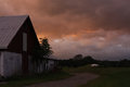
asleepby posthumousComment: Gorgeous. Might have liked a brighter face to the building and the various greens. but that may have taken away from the clouds. Great image! Maybe not late enough for most, but I love it! :-) |
 Photographer found comment helpful. Photographer found comment helpful. |
| 08/31/2011 05:26:42 AM |
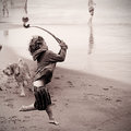
IMG_4634xxby markwileyComment: I guess I was the only one who preferred this one :-) I think it'll do well. I'd give it a 7 or 8. Might have suggested cloning out the dog though.
Really nice image! |
| Photographer found comment helpful. |
| 08/29/2011 09:23:31 AM |
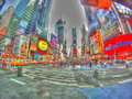
"C" is for Crowdsby genova24Comment: One of the ways I judge images and vote is as follows: do I think the processing effect lends itself well to the image?
In this case the answer is no. I would have loved to have seen this with subtler processing with perhaps the liberal saturation boost that is here if that's what you're looking for. I think a strong sharp contrasted image would have scored much better.
However, this is just my opinion. I don't know what you were trying to achieve. If it was this you did it excellently. I really do like the perspective used here. |
| 08/29/2011 08:44:37 AM |
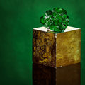
Chrome Dioptase Crystalsby CoryComment: Hmm. I gave this an 8. Nearly 2 more than it deserved, apparently. Must vote lower next time.
:-) Just kidding. Nice image. Loved the background. |
| Photographer found comment helpful. |
| 08/29/2011 08:29:19 AM |
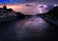
all is calm, all is bright and it's only Augustby mariucaComment: Well. Wow. This is incredible.
The gradient in the water. The depth of the image. The lighting of the front of the bridge. Its descent into darkness on the left. The soft haze of rainfall in the distance. The mocking sun-rays on the left. The fear the boaters must be facing. This is not a simple image. While I would have done some lens distortion correction to straighten the building on the left, I like the thought that it's shying away from the lightning.
Wherever this image ends up, it is in credible. Easiest 10 I've given in a long time. |
| Photographer found comment helpful. |
| 08/29/2011 08:20:14 AM |
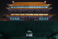
South gate by markheath10Comment: I really love the person silhouetted in the doorway. It gives the image a great edge. |
| Photographer found comment helpful. |
| 08/29/2011 08:16:49 AM |
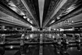
Light Under the Bridgeby lukaskComment: It's not very obvious that it's water under until you look at it closely.
Wonderful perspective. Really nice. |
| Photographer found comment helpful. |
| 08/29/2011 08:15:08 AM |
Cornby colorcarnivalComment: I think the black and white conversion of this made it for me. And the curves of the leaf. And the vertical orientation.
Somehow it says I gave you 5 for this. Which is bizarre! Must have pressed 5 on the keypad instead of 8. Hmm. That's the second time I have noticed this happening. I wonder how often it happens. |
| Photographer found comment helpful. |
| 08/29/2011 08:12:02 AM |
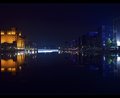
Bridge of Lightby Kevin_FlynnComment: I really like this image. Nice work.
There are two things I think I would have done slightly different. Small things. But then again I have a tendency of being too liberal with my slider bars so don't necessarily take my word for it.
First, I really like the dividing border colour. The light blue. It's a really nice touch. But why didn't you do the same with the black part of the border? A darker blue I think might have supported the image more. There's hardly a speck of black in your image, and the border sets itself apart in sharp contrast against the rest of the image... and not in a good way to my eyes.
I might also have lowered the curves towards the darker end. But I could see that making the image over-dark, so I can understand why it mightn't have been done.
Really nice image again. 7 |
| Photographer found comment helpful. |
| 08/29/2011 08:03:34 AM |
SS Klondikeby JonoTuckerComment: I see a couple of things here that I woul dhave changed.
First, the good. I like the use of negative space here. The centre composition works very well for this subject.
Next... the ship (or is it a boat?) is too bright. It should be bright, yes, to stand out. But in my viewing I think it's so bright that we lose some nice details on it. There are two ways I might have tried to address this. 1) use a lower exposure value on the camera. 2) make a HDR image of the thing. I would have chosen the latter because if treated moderately it would still retain the authentic feel of the image you have here, while boasting more textures, details and depth that the eye can see, but that the camera cannot.
Lastly, you used a wide angle lens for this, I take it. The light on the left is tilted, where it should be vertical. You might have been able to use lens distortion removal software to reduce this. This kind of distortion can add a lot to images now and then, but I don't think the ship/boat is big enough to deserve the sense of scale that might bring.
5
Just some thoughts. |
| Photographer found comment helpful. |
Home -
Challenges -
Community -
League -
Photos -
Cameras -
Lenses -
Learn -
Help -
Terms of Use -
Privacy -
Top ^
DPChallenge, and website content and design, Copyright © 2001-2026 Challenging Technologies, LLC.
All digital photo copyrights belong to the photographers and may not be used without permission.
Current Server Time: 07/17/2026 10:54:50 PM EDT.